You are here: Home/ Art / Art House Co-Op’s “The Sketchbook Project” Moleskine sketches, pages 12-13
The BonFX Letter
One good pairing. Every Tuesday.
2-minute read · free
This week — no. 14
Quiet authority
Merriweather sets the tone in one line. Lato stays out of the way and lets it.
MERRIWEATHER 700 + LATO 400
A font specimen, a pairing that works, and one line on why it works. That is the whole email.
Free. One click to unsubscribe. No sharing, ever.
Art House Co-Op’s “The Sketchbook Project” Moleskine sketches, pages 12-13
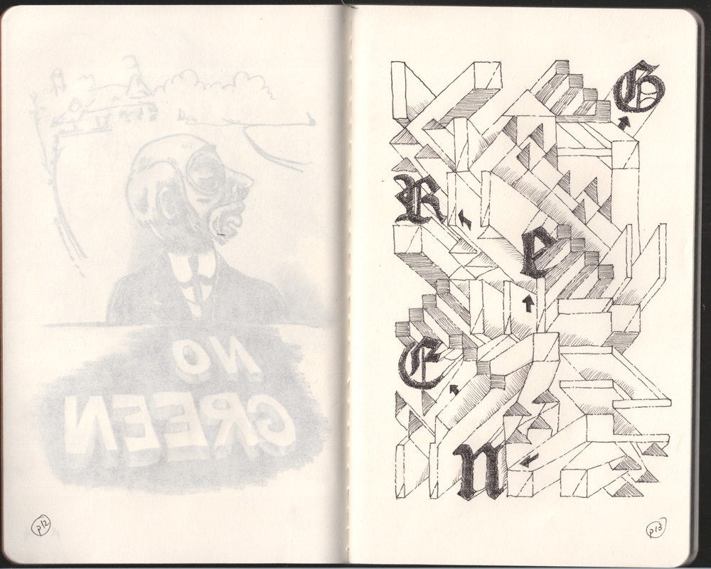
For pages 12-13 of my Art House Co-Op “Sketchbook Project” Moleskine, I wanted to do a simple exercise using quasi-isometric shapes. The inclusion of Blackletter type is just totally random. I drew the substructure in pencil and did the black and white work with a Micron .01. The Moleskine paper in this particular book has not grown fond of me nor I of it.
The Moleskine paper is prone to bleeding anything and everything. If I open the Moleskine in room lighting, it looks exactly like the scan. I normally use a variety of acid-free, heavy weight white paper with the thick wire binding you see in various sizes at any art store. I have never bled through any of the pages. It must be this particular model.
While the flatness and paper texture are wonderful, the Moleskine paper weight is not heavy enough to support really any media without bleeding. Oh well.
As my project is entitled, “It’s not easy being green”, we can now add “It’s not easy drawing in a semi-transparent Moleskine notebook”, and hence, I have to draw concepts, if any, very lightly on the even page and focus on only using one side of the odd page.
NOTE: Click for enlargements
Moleskine sketchbook pages 12-13
Blackletter type of the word "Green" with lots of angles surrounding.
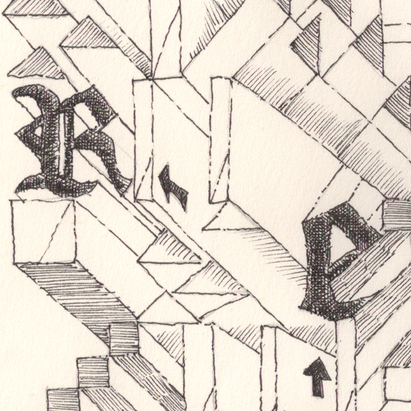
Close up and cross hatching of a few letters and angles.
About Douglas Bonneville
Douglas has been a graphic designer since 1992, in addition to software developer and author. He is a member of Smashing Magazine's "Panel of Experts" and has contributed to over 100 articles. He is the author of "The Big Book of Font Combinations", loves cats, and plays guitar.
No, those moleskines are really, really thin. I just ordered a “normal” moleskine for comparison, and the paper must be 4x as thick. The only solution I had towards the end was to draw only on one page and not on the back of that page.
About BonFX
Douglas Bonneville has been a graphic designer since 1992 and has written about type here since 2009. BonFX is a blog about typography and design, and the books that came out of it.

How many pages does it have total? I’m thinking about doing it…
Mine was 40 pages…sounded so few when I got started!
Hi,
Great work… Even I’m having trouble with the weight of the paper. Did you find a way to make it work?
No, those moleskines are really, really thin. I just ordered a “normal” moleskine for comparison, and the paper must be 4x as thick. The only solution I had towards the end was to draw only on one page and not on the back of that page.