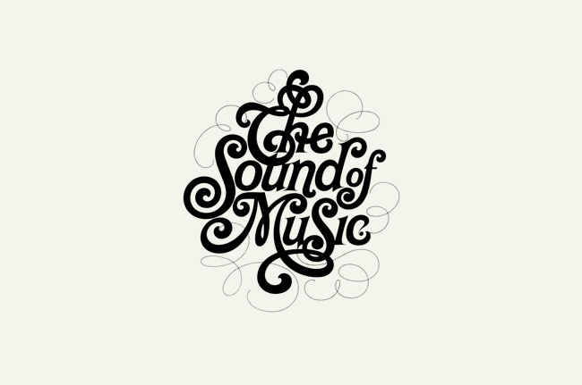
“Just as every musical score has its home key, in typography the contrast of size of the typographic elements is almost a prerequisite for all other contrasts. A strong contrast in the size of the elements is basic, and all other contrasts are extra effects introduced into relationship.”—Carl Dair, Design with Type
Industry Pulse: Top Typography books in 2013
We like to keep an eye on what typography books people are reading. Every so often we do our own research using a variety of sources to get a pulse on what typography resources have people’s heart beating a little faster. … [Read More]Typography Quote of the Day: Communication

“Form without function is formalism. Typography can neither be modern nor beautiful if it just pays homage to form rather than fulfill its purpose – a legible communication.”-Robert Büchler
Related Articles
Improve Your Typography: Over 100 Tips from 12 Top Resources

It’s no trouble to be reminded of the simple things we can do to improve our typographic chops! This quick list of a dozen top typography resources feature over 100 easy-to-grasp hints, tips, and bits of advice. If you are a type newbie, spend a few minutes soaking up some new (to you) typography advice. If you are a seasoned type pro…well…spend a few minutes re-soaking up some old (to you) typography advice! Nobody remembers everything, right?
Typography Quote of the Day: Great Ads
“You can do a good ad with poor typography, but you can’t do a great ad with poor typography.”—Herb Lubalin