(UPDATE 10/12/2010: Gap has pulled their new logo and their crowdsourcing wunder-blunder attempt at damage control. Nonetheless, I hope my contribution of humorous satire for this sad episode has some residual therapeutic value for all parties involved.) 🙂
Gap selected my crowdsource entry for their logo design contest! I won a Gap shopping spree for $20 (limited to the sale rack in the back) plus I get to put the new logo in my portfolio! Here goes:
Tongue removed from cheek. Please see Gap’s Facebook page for the crowdsource fiasco brewing, but also visit crowdsource destination number one, 99 designs.
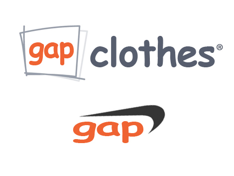
UPDATE: So many people asked to see my preliminary work, I decided to post a little sneak peak at some early drafts. Remember, these were only drafts and NOT final work. (Tongue planted, and then quickly removed, from same said cheek referred to above):
Further Reading
- New Gap Logo Hated by Many, Company Turns to Crowdsourcing Tactics – Velocity – Remaking Personal Technology – Forbes
- Gap’s new logo: a social-media experiment?
- Numbers – The ever-shifting realities of crowdsourcing and design contest sites
- The kiddie designers of 99designs
- Why crowdsourcing your brand is bad
- Crowdsourcing your logo, the good, the bad and the ugly

LOL, you just couldn’t help yourself could you? 😉
Hey, that was just asking to be done. It practically designed itself, right out of the collective borg crowdsource brain! I was just there when lightning struck. That is all 🙂
These are worse than what the Gap has come up with themselves. Comic Sans, are you kidding me? That’s what people use who have never actually taken a typography class in their lives. And I don’t even know what to say about the reverse upside-down Nike logo with *stretched* Comic Sans.. these are like scratching your nails down a chalkboard. Please, leave this to a professional. (Something that the Gap should’ve done to begin with.)
Summer: I’m not sure if your tongue is in your cheek or if the joke is on you 🙂 Follow the links 🙂 🙂
If you don’t follow the link to 99designs.com, you won’t get the joke. (Hint: look carefully at the 99designs.com logo and my “original” crowdsource logo)