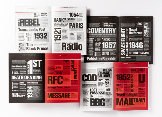
“Typography is known as an invisible art, because if a typographer has done a good job and produced a page that flows and is ‘easy on the eye’, he has done his job and the reader doesn’t notice. A page that is badly designed will be difficult and irritating to read. Whether you are reading in the office for work, or at home for pleasure, and no matter how interesting the actual content , if a book is uncomfortable on the eye then the enjoyment of reading is spoiled.”—Jim Williams, Type Matters!
