Twenty-five quotes on type from the typographers, type designers and teachers who shaped the craft: Robert Bringhurst, Adrian Frutiger, Herb Lubalin, Carl Dair, James Craig, Zuzana Licko, Wolfgang Weingart and more. Each quote keeps its source and the type image that ran with it. They first ran on BonFX in 2013 as the Typography Quote of the Day series, one post a day; here they are on one page, in the order they ran.
Emotions

“A love of letters is the beginning of typographical wisdom. That is, the love of letters as literature and the love of letters as physical entities, having abstract beauty of their own, apart from the ideas they may express or the emotions they may evoke.”– Designing with Type, James Craig
Expression
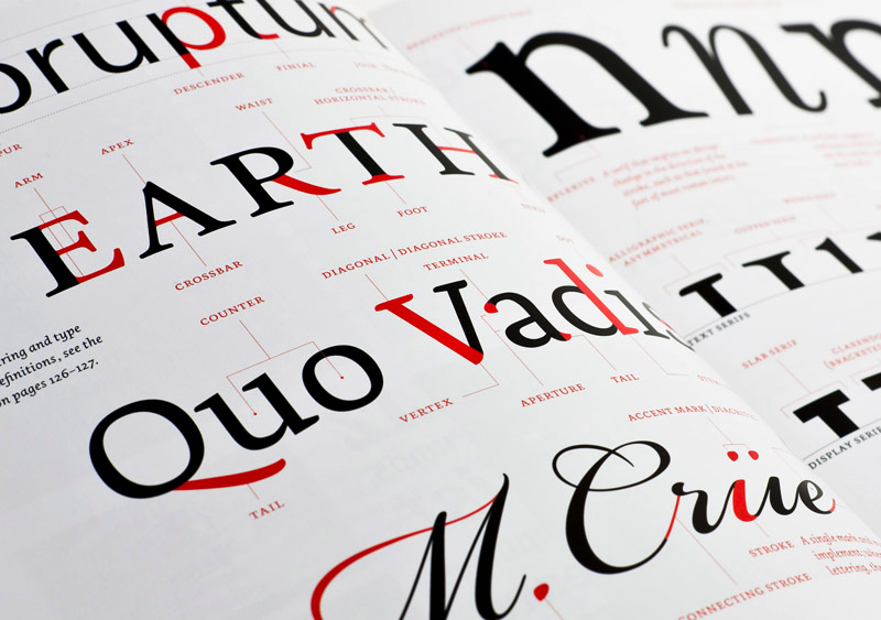
“Faces of type are like men’s faces. They have their own expression; their complexion and peculiar twists and turns of line identify them immediately to friends, to whom each is full of identity.”— J.L. Frazier
Little Squiggles
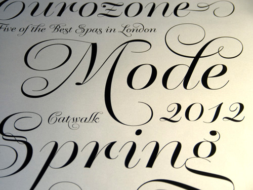
“Figures are the most shocking things in the world. The prettiest little squiggles of black looked at in the right light, and yet consider the blow they can give you upon the heart.”–H.G. Wells, The History of Mr. Polly
Helvetica is King
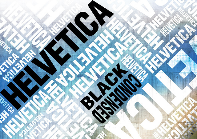
“Any good typeface can be completely destroyed when misused or extensively overused. Helvetica seemed to sustain a beating like no other. Still fresh, still popular Helvetica is king.”-Alexander Gelman
Love of Letters
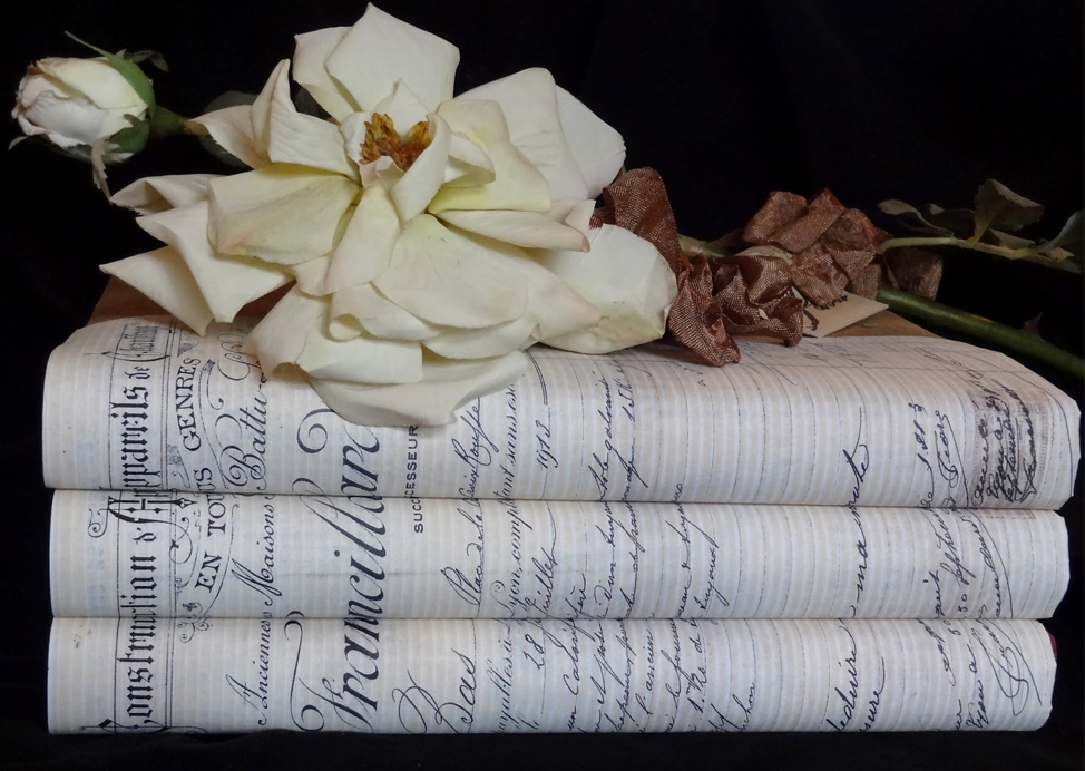
“A love of letters is the beginning of typographical wisdom. That is, the love of letters as literature and the love of letters as physical entities, having abstract beauty of their own, apart from the ideas they may express or the emotions they may evoke.”-John R. Biggs
Black and White
“Black and white is the simplest and the most radical expression.”-Werner Jeker
Great Ads
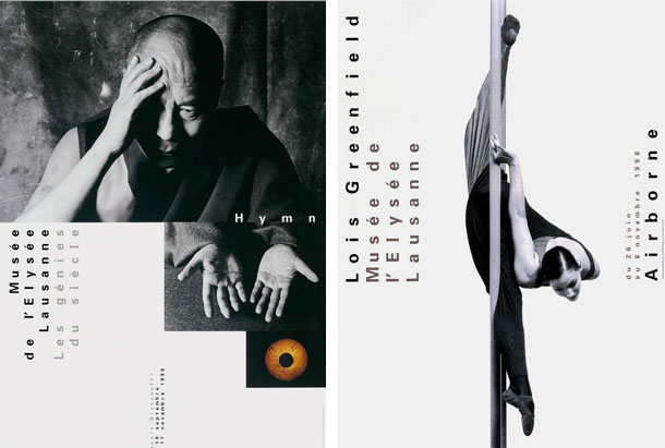
“You can do a good ad with poor typography, but you can’t do a great ad with poor typography.”—Herb Lubalin
Communication

“Form without function is formalism. Typography can neither be modern nor beautiful if it just pays homage to form rather than fulfill its purpose – a legible communication.”-Robert Büchler
Contrast in Size
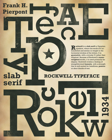
“Just as every musical score has its home key, in typography the contrast of size of the typographic elements is almost a prerequisite for all other contrasts. A strong contrast in the size of the elements is basic, and all other contrasts are extra effects introduced into relationship.”—Carl Dair, Design with Type
Organization

“…the first function of a piece of printing is to capture attention, design with type requires that the designer understand how to make visual units group together for easier organization in the observer’s mind. Many typographical compositions unfortunately look as though the single goal had been to camouflage the message—and sometimes the success is phenomenal.”—Carl Dair, Design with Type
Most Popular Typefaces
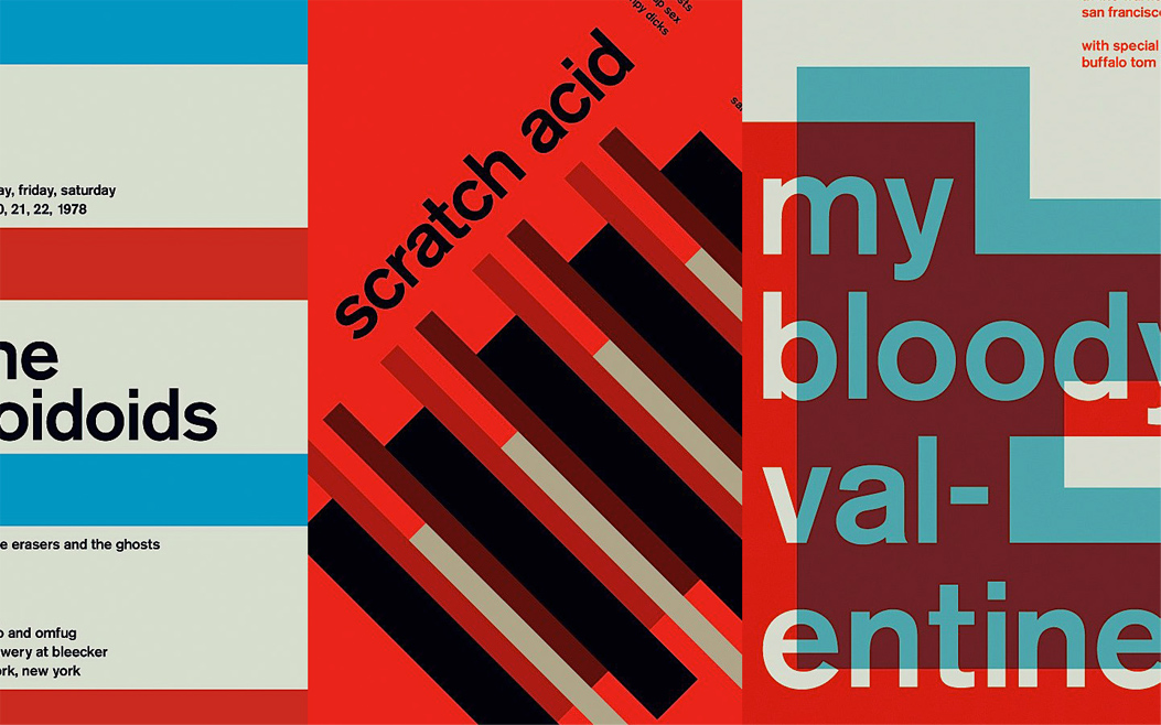
“The most popular typefaces are the easiest to read; their popularity has made them disappear from conscious cognition. It becomes impossible to tell if they are easy to read because they are commonly used, or if they are commonly used because they are easy to read.”—Zuzana Licko
Variety and Complexity
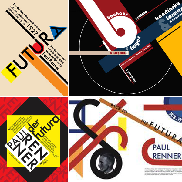
Simplicity is good, but so is plurality. Typography’s principal function (not it’s only function) is communication, and the greatest threat to communication is not difference but sameness. Communication ceases when one being is no different from another: when there is nothing strange to wonder at and no new information to exchange. For that reason among others, typography and typographers must honor the variety and complexity of human language, thought and identity, instead of homogenizing or hiding it.”—Robert Bringhurst, The Elements of Typographic Style
Meaningful Marks
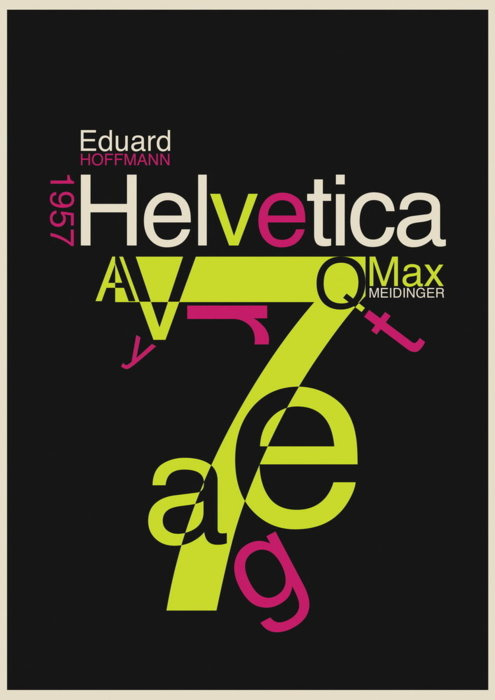
“Writing begins with the making of meaningful marks. That is to say, leaving the traces of meaningful gestures. Typography begins with arranging meaningful marks that are already made In that respect, the practice of typography is like playing the piano – an instrument quite different from the human voice. On the piano, the notes are already fixed, although their order, duration and amplitude are not. The notes are fixed but they can be endlessly rearranged, into meaningful music or meaningless noise.”—Robert Bringhurst, The Elements of Typographic Style
Letterforms
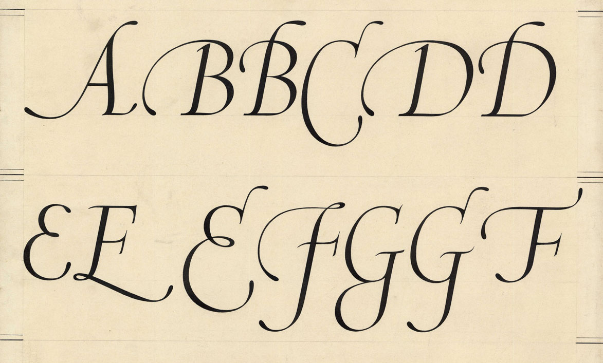
“Letterforms that honor and elucidate what humans see and say deserve to be honored in their turn. Well-chosen words deserve well-chosen letters; these in their turn deserve to be set with affection, intelligence, knowledge and skill. Typography is a link, and it ought, as a matter of honor, courtesy and pure delight, to be as strong as the others in the chain.”—Robert Bringhurst, The Elements of Typographic Style
Harmony
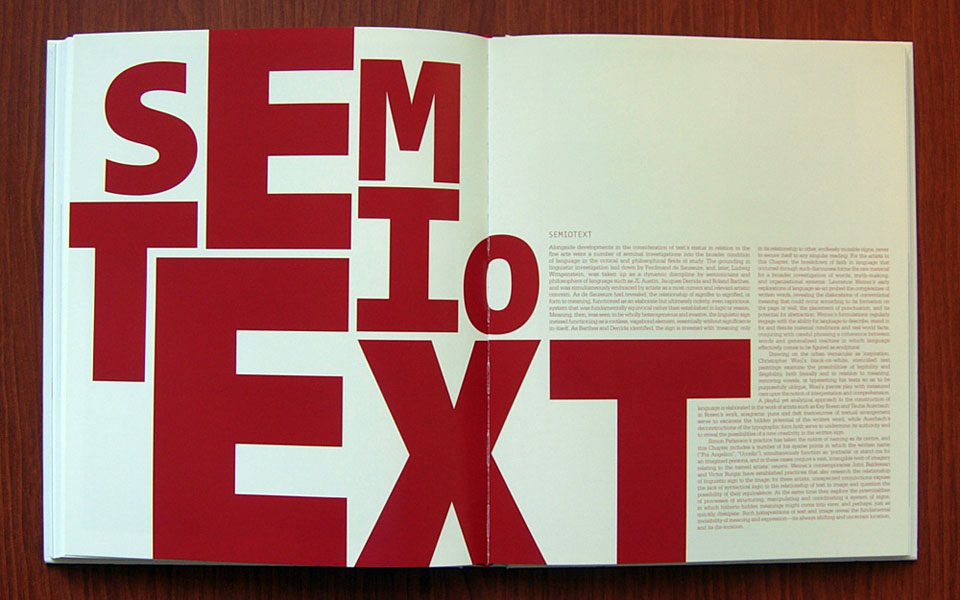
“The objective of Typographic design is to organize all of the elements of communication into a harmonious and unified whole, either by achieving a quiet uniformity of similar elements or by the visually exciting use of contrasting ones. What determines the result is the way in which the diverse elements are organized in relation to each other, the contributions each makes to form, texture, and weight, and the effect of their relation with the space in which they exist.”-Carl Dair, Design with Type
Working with Restrictions
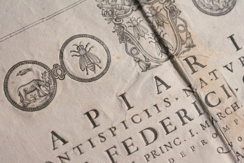
“One of the things I have observed, looking back historically, is how elegant a seventeenth-century book looks. One of the reasons it looks so elegant is because of the restrictions: there was only one typeface available, there weren’t that many fonts, and virtually all you could do was play with sizes, italics, and so forth.”
—Colin Forbes
Process of Type Design
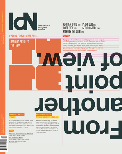
“Designing text is the process of selecting a typeface, deciding which words or phrases should be emphasized, and determining how the type should be arranged on a page. The final design will be influenced by the copy you work with, the intended audience, your understanding of the principles of typography, and consideration of how we read. This holds true whether your goal is to make the experience of reading as comfortable as possible or to challenge accepted typographic conventions.”—James Craig, Designing with Type
Legibility vs. Readability
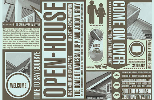
Legibility is another area where the designer can be misled by what seems like an obvious dictate in type selection and design. There can be no question about the readability of the message, but legibilty and readability are not quite the same — a dull and uninteresting presentation in a highly legible typeface will not be widely read. There have been many studies of comparative legibility, and each study seems to surface with slightly different conclusions. For the designer, the best solution is to use his material in such a way that it arouses interest and invites reading.—Allen Hurlburt, Layout: The Design of the Printed Page
Frutiger on White Space

“When I put my pen to a blank sheet, black isn’t added but rather the white sheet is deprived of light. […] Thus I also grasped that the empty spaces are the most important aspect of a typeface.”— Adrien Frutiger
Bringhurst on Timelessness and Time
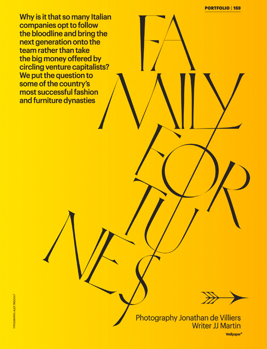
“In a world rife with unsolicited messages, typography must often draw attention to itself before it will be read. Yet in order to be read, it must relinquish the attention it has drawn. Typography with anything to say therefore aspires to a kind of statuesque transparency. It’s other traditional goal is durability: not immunity to change, but a clear superiority to fashion. Typography at its best is a visual form of language linking timelessness and time.”—Robert Bringhurst, The Elements of Typographic Style
Attention to Detail
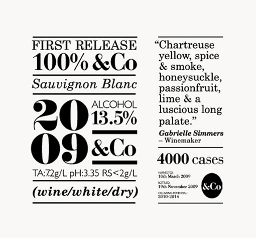
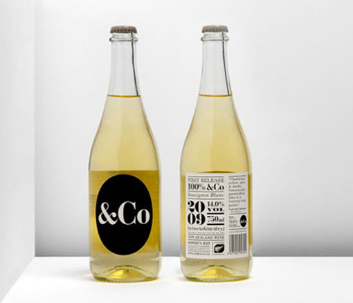
“Beautiful type comes from attention to myriad tiny details. It’s built up a fraction of an em at a time, through hundreds of decisions whose geometry belies their gravity. It requires, as a colleague once wrote, a heart hardened against accusations of being too fussy.”— James Felici, The Complete Manual of Typography
Typography as Invisible Art
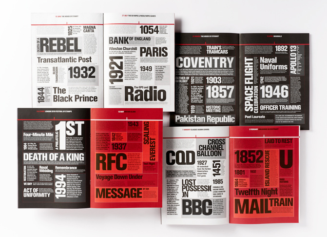
“Typography is known as an invisible art, because if a typographer has done a good job and produced a page that flows and is ‘easy on the eye’, he has done his job and the reader doesn’t notice. A page that is badly designed will be difficult and irritating to read. Whether you are reading in the office for work, or at home for pleasure, and no matter how interesting the actual content , if a book is uncomfortable on the eye then the enjoyment of reading is spoiled.”—Jim Williams, Type Matters!
Spaces, Not Voids in Typesetting
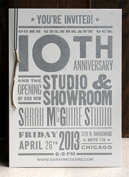
“If there is an essential truism in typesetting, it is that a page contains no voids, only spaces between printed elements. The essence of typesetting is regulating the size of those spaces to control the balance and rhythm between black and white. This is the key to a graphically harmonious page—one with good type color—as well as to text that is pleasing and easy to read.”—James Felici, The Complete Manual of Typography
Enriching Yesterday’s Typography
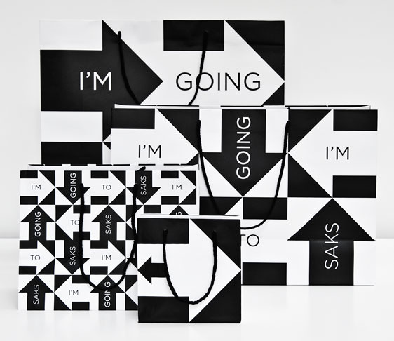
“What is original and dynamic today, will be yesterday’s design tomorrow. New and innovative typography does not necessarily replace existing forms of typographic expression, but supplements them and thereby enriches the world of typography. Learn to appreciate all forms of typography, determining for yourself what is appropriate for specific projects.”—James Craig, Designing with Type
Attracting attention is part of communicating
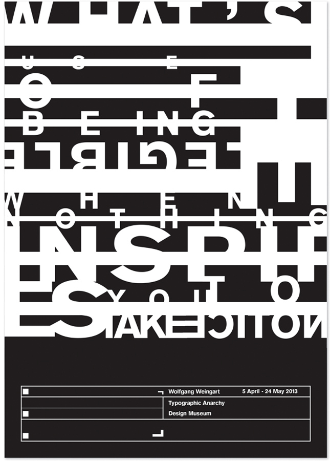
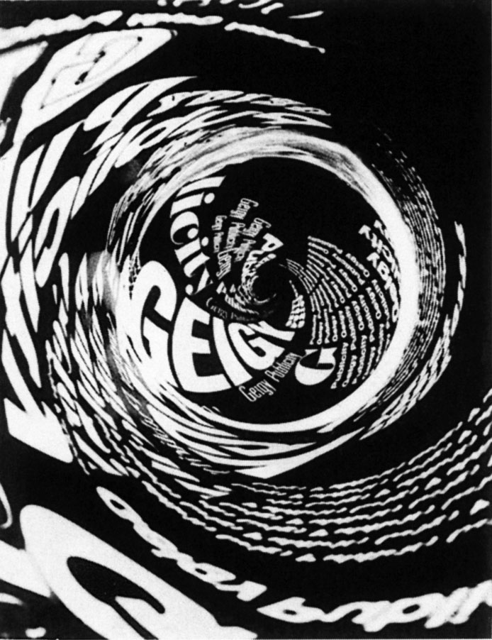
“What’s the use of being legible, when nothing inspires you to take notice of it?”
—Wolfgang Weingart
