You are here: Home/ Graphic Design / Five Principles of Design on Wine Bottles
The BonFX Letter
One good pairing. Every Tuesday.
2-minute read · free
This week — no. 14
Quiet authority
Merriweather sets the tone in one line. Lato stays out of the way and lets it.
MERRIWEATHER 700 + LATO 400
A font specimen, a pairing that works, and one line on why it works. That is the whole email.
Free. One click to unsubscribe. No sharing, ever.
Five Principles of Design on Wine Bottles
The principles of design are simple guidelines used to organize the various elements of design (line, texture, color, etc.) in a composition. Five basic principles that we illustrate here are: balance, unity, rhythm, proportion and emphasis. Good art has both elements AND principles of design cooperating well together creating a composition aesthetically pleasing to the eye.
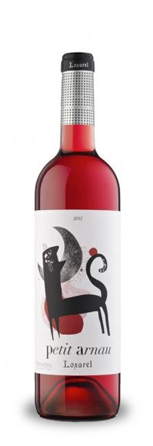
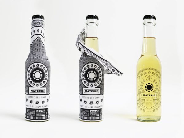
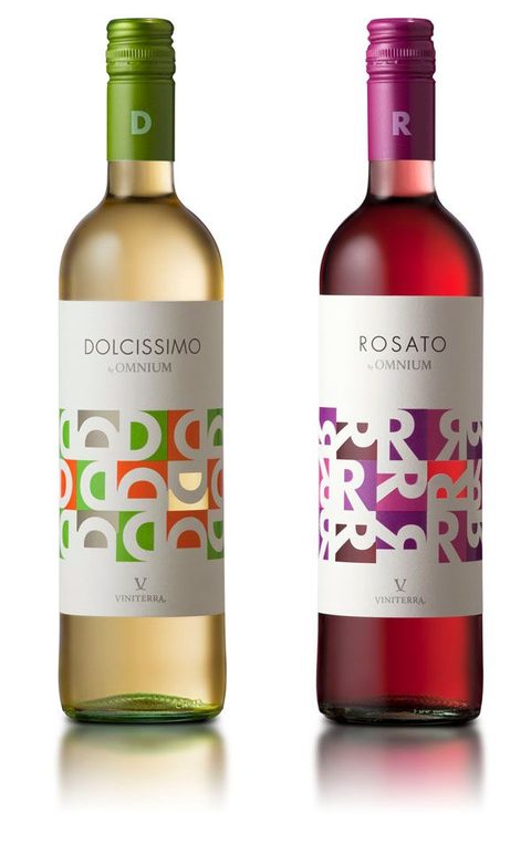
Below we show examples of fun wine bottle designs where several of these principles have been applied.
Five Principles of Design
1. Balance
Balance has to do with visual stability, and relates to our physical sense of balance; it is a reconciliation of opposing forces. Strong compositions achieve balance either symmetrically or asymmetrically.
2. Unity
Unity is the root principle summarizing all the other elements in design. It is unity that achieves overall harmony with all the elements for a holistic and consistent composition.
3. Rhythm
An important element of design is visualrhythm, or movement which is achieved when using the principles repetition, gradation (involving sequence progression of steps) and alternation (repeating pattern presented in turn). The repetitions can be made subtly at a foundational level, or more boldly using distinct elements in a composition.
4. Proportion
Another principle of design is Proportion. This is attained when a desirable relationship is found between the elements in the composition relating to size, color, quantity, or degree. Good proportion adds unity, symmetry, or balance among the parts of a design.
5. Emphasis
Emphasis can be brought about in several ways, often by using contrast, color, shape or texture. It’s also referred as point of focus as it breaks, or interrupts the flow of the composition drawing attention to the intended elements.
About Douglas Bonneville
Douglas has been a graphic designer since 1992, in addition to software developer and author. He is a member of Smashing Magazine's "Panel of Experts" and has contributed to over 100 articles. He is the author of "The Big Book of Font Combinations", loves cats, and plays guitar.
About BonFX
Douglas Bonneville has been a graphic designer since 1992 and has written about type here since 2009. BonFX is a blog about typography and design, and the books that came out of it.