
What fonts go with Neuton? This smooth, Dutch-inspired serif brings bold confidence and straightforward elegance that demands partners capable of matching its powerful personality without overwhelming the page.
Neuton was designed by Brian Zick as a free, open-source typeface with old-style characteristics reminiscent of Times but with its own distinctive voice. The design features a large x-height that keeps text legible even at smaller sizes, combined with perfect curves and angles that give it an almost mathematical precision. Its five weights offer remarkable range, from elegant thin weights for refined display work to bold and extra-bold variants that command attention in headlines and banners.
Pairing Neuton requires acknowledging its confident personality. Sans-serif companions can provide modern contrast that balances Neuton’s traditional roots, while alternative serifs should complement rather than compete. Bold and powerful brands with straightforward messages benefit most from Neuton pairings. Here are 15 fonts that work well with Neuton, each chosen to extend its capabilities across different design contexts.
1. Montserrat

Montserrat‘s geometric precision creates compelling contrast against Neuton’s old-style curves. Julieta Ulanovsky’s tribute to Buenos Aires signage brings urban sophistication that modernizes Neuton’s traditional character. The x-heights align well enough for comfortable transitions, while the fundamental difference in design philosophy—geometric versus calligraphic—creates visual tension that energizes layouts. This pairing excels in brand identities wanting both contemporary edge and classical grounding.


2. Lato

Lato brings humanist warmth that complements Neuton’s smooth sophistication. ?ukasz Dziedzic designed a sans-serif with semi-rounded details that feel friendly without sacrificing professionalism. Against Neuton’s more formal character, Lato introduces approachability that works beautifully for corporate communications, educational content, and any project bridging traditional authority with modern accessibility. Use Lato for body text, Neuton for headlines that need gravitas.


3. Mulish

The minimalist elegance of Mulish pairs naturally with Neuton’s refined character. Vernon Adams and Cyreal created a geometric sans-serif that reads as contemporary and inviting, perfect for balancing Neuton’s more assertive personality. This pairing calls for attention through restraint—Neuton’s smooth serif curves against Mulish’s clean lines create a dynamic that feels both bold and sophisticated. Ideal for brands with straightforward messages wanting visual polish.


4. Barlow

Barlow brings California cool to Neuton’s European sophistication. Jeremy Tribby’s slightly rounded sans-serif carries highway sign inspiration that adds pragmatic clarity to layouts. Against Neuton’s traditional serif elegance, Barlow introduces American optimism that works well for tech companies, startups, and brands bridging old-world refinement with new-world energy. Documented in real-world use on typography websites, this pairing delivers reliable results.


5. Raleway

The elegant geometry of Raleway creates refined contrast with Neuton’s old-style forms. Matt McInerney’s creation features thin weights that dance with Neuton’s lighter variants, while bolder weights provide solid anchoring for interface elements. Both fonts share commitment to sophisticated readability, making their pairing feel intentional rather than accidental. This combination suits fashion brands, design portfolios, and any project where typographic elegance signals quality.


6. Work Sans

Work Sans earns its name through functional clarity that complements Neuton’s confident display presence. Wei Huang’s early grotesque revival brings workhorse reliability that handles body text while Neuton commands headlines. Featured in typography pairing collections specifically recommending Work Sans caps in bold weight for navigation elements alongside Neuton, this combination delivers tested results for editorial and brand applications.


You'll love this article!
A visual guide for designers.
7. PT Sans

PT Sans brings humanist foundations that harmonize with Neuton’s traditional character. Alexandra Korolkova’s Public Type project contribution carries institutional credibility while maintaining warm approachability. Against Neuton’s old-style elegance, PT Sans provides the kind of neutral contrast that works everywhere—government communications, educational platforms, and publishing projects where both fonts’ commitment to accessibility serves diverse audiences.


8. Open Sans

Steve Matteson’s Open Sans offers optimized neutrality that lets Neuton’s personality shine. Both fonts prioritize readable functionality, but their different approaches—Neuton’s historical references versus Open Sans’s humanist pragmatism—create complementary contrast. This pairing excels in content-heavy applications where hierarchy matters: Neuton for compelling headlines, Open Sans for the comfortable body text that serves long-form reading.


9. Source Sans Pro

Adobe’s first open-source typeface, Source Sans Pro, shares Neuton’s commitment to thoughtful, systematic design. Paul D. Hunt created a sans-serif optimized for user interfaces that reads as clean without being sterile. Against Neuton’s old-style warmth, Source Sans Pro provides modern efficiency that works beautifully for digital publishing, documentation sites, and any project bridging traditional typography with contemporary accessibility.


10. Roboto

Roboto and Neuton represent different design philosophies finding common ground. Christian Robertson’s Google workhorse brings mechanical precision with friendly curves, while Neuton offers classical elegance with perfect angles. Together they create a system that feels both contemporary and timeless—ideal for applications, websites, and brand identities needing to signal modernity while maintaining typographic depth.


11. Fira Sans

Fira Sans brings Mozilla DNA to Neuton pairings. Erik Spiekermann’s screen-optimized design features open apertures and clear differentiation that complement Neuton’s confident character. The humanist warmth softens what could be stark contrast between serif and sans-serif, creating professional harmony. This pairing suits tech companies, developer documentation, and digital products wanting both typographic sophistication and screen-first functionality.


12. Nunito

Nunito‘s rounded terminals bring friendly warmth that balances Neuton’s more formal disposition. Vernon Adams designed a sans-serif that reads as approachable without being casual—the perfect counterweight to Neuton’s assertive elegance. Together they create layouts that feel both professional and welcoming. This pairing works wonderfully for educational platforms, family brands, and any project where Neuton’s confidence needs softening for broader audiences.


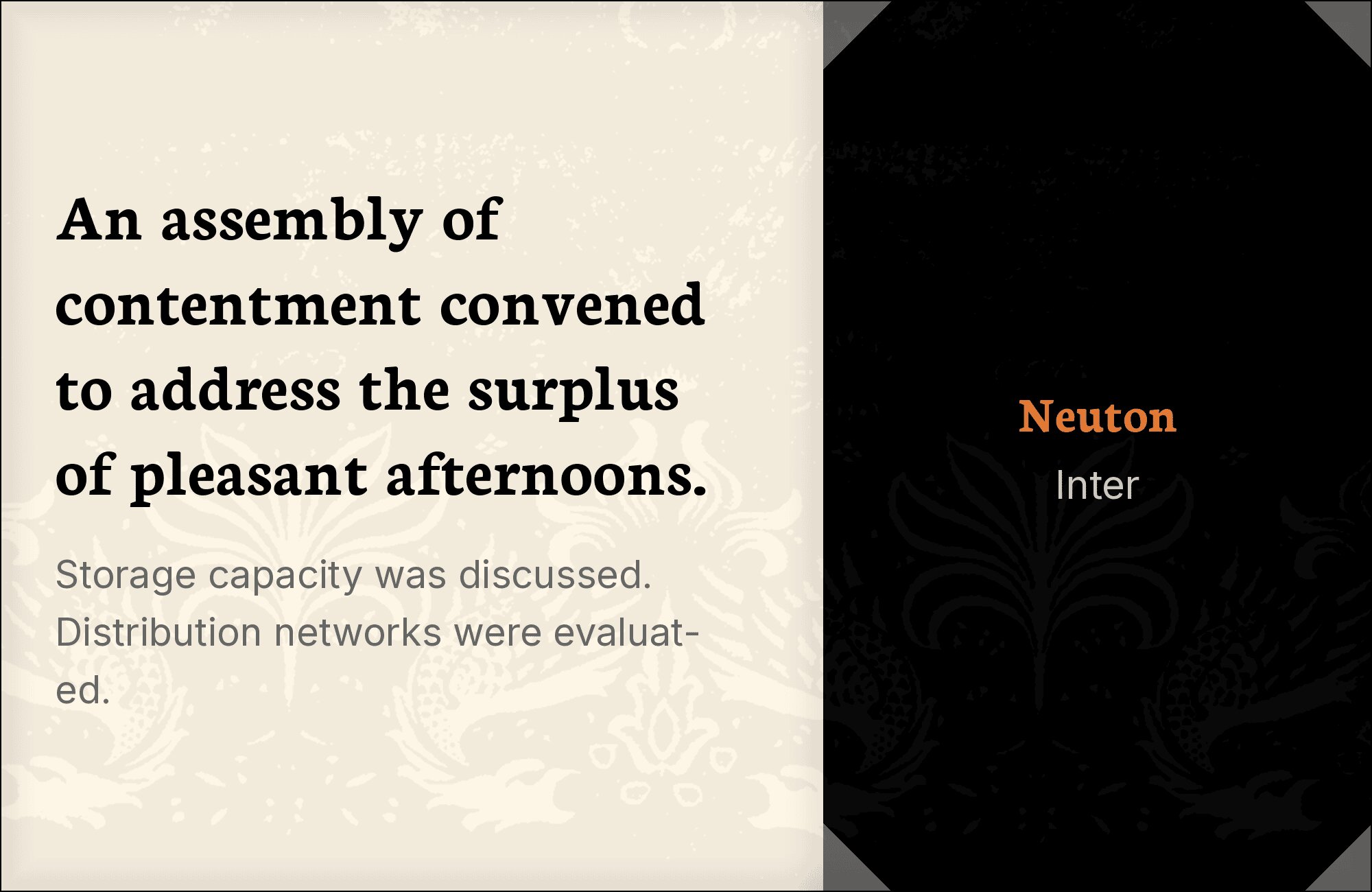
13. Inter
Screen-first meets tradition when Inter pairs with Neuton. Rasmus Andersson’s meticulous creation brings interface optimization that complements Neuton’s display elegance. Both fonts share commitment to legibility—Neuton through its generous x-height, Inter through its carefully tuned vertical metrics. This pairing excels in dashboard-heavy applications, SaaS products, and any digital interface where Neuton headlines need body text built for the screen.

14. News Cycle

News Cycle brings newspaper heritage that creates generational dialogue with Neuton’s old-style roots. Nathan Willis designed a condensed sans-serif efficient enough for tight headline situations, creating practical contrast with Neuton’s more generous proportions. Documented by Typewolf in real-world use on editorial websites, this pairing suits publications, news platforms, and any project where typographic efficiency serves content delivery.


15. Manrope

Manrope‘s geometric precision provides contemporary balance to Neuton’s classical foundations. Those open apertures and generous x-height create modern contrast that energizes traditional layouts. The systematic design philosophy behind Manrope complements Neuton’s careful construction—both fonts reward attention to detail. This pairing excels in fintech, SaaS products, and professional services where brands need to signal both innovation and trustworthiness.


Conclusion
There are no absolute rules for font pairing, just principles to guide you. The key is contrast—in weight, in style (serif vs. sans-serif), or in personality. Neuton is versatile enough to play well with many different typefaces.
Trust your eye, experiment freely, and remember that the best pairing is the one that serves your content and audience. Typography should enhance communication, not complicate it.