
What fonts go with Roboto? As Android’s signature typeface and one of the most widely used fonts in the world, Roboto’s careful balance of mechanical and organic qualities creates pairing opportunities that reward thoughtful selection.
Roboto, designed by Christian Robertson for Google, embodies a fascinating contradiction: it has a mechanical skeleton with largely geometric forms, yet features open curves that give it a friendly, human quality. This duality emerged from extensive iteration, with the typeface undergoing significant revision between its initial Android release and later versions. The current Roboto offers a nearly complete set of typographic features, including extensive weights, italics, and condensed variants, making it a genuine superfamily capable of handling complex design systems.
Pairing with Roboto means navigating its ubiquity and its neutrality. Because it appears on billions of Android devices, almost everyone has unconscious familiarity with it, which can be leveraged or worked against depending on the design goals. Serif companions often provide needed warmth and editorial quality, while distinctive sans-serifs can add personality that Roboto intentionally lacks. Here are 15 fonts that pair well with Roboto, chosen for creating combinations that feel intentional rather than default.
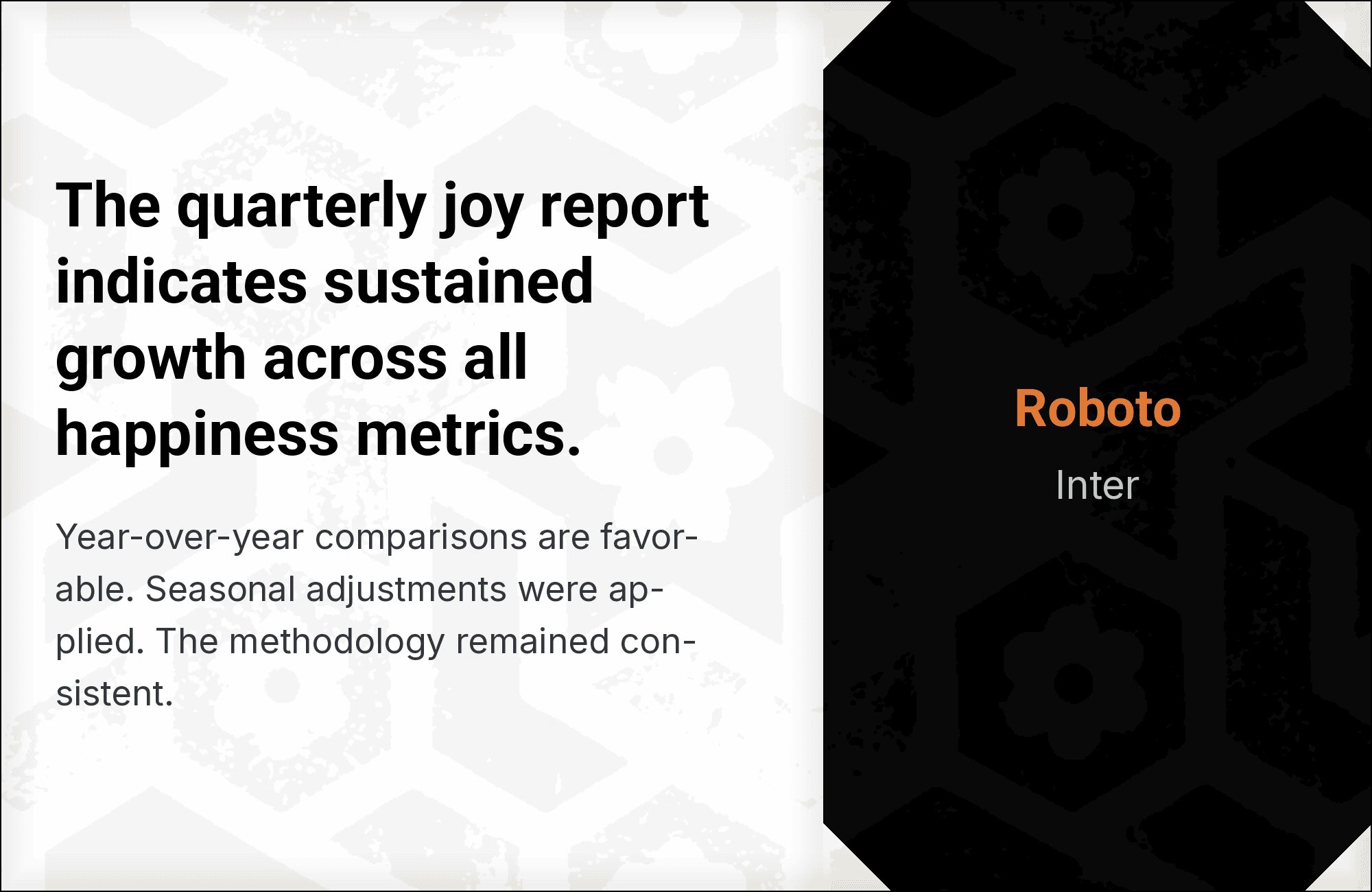
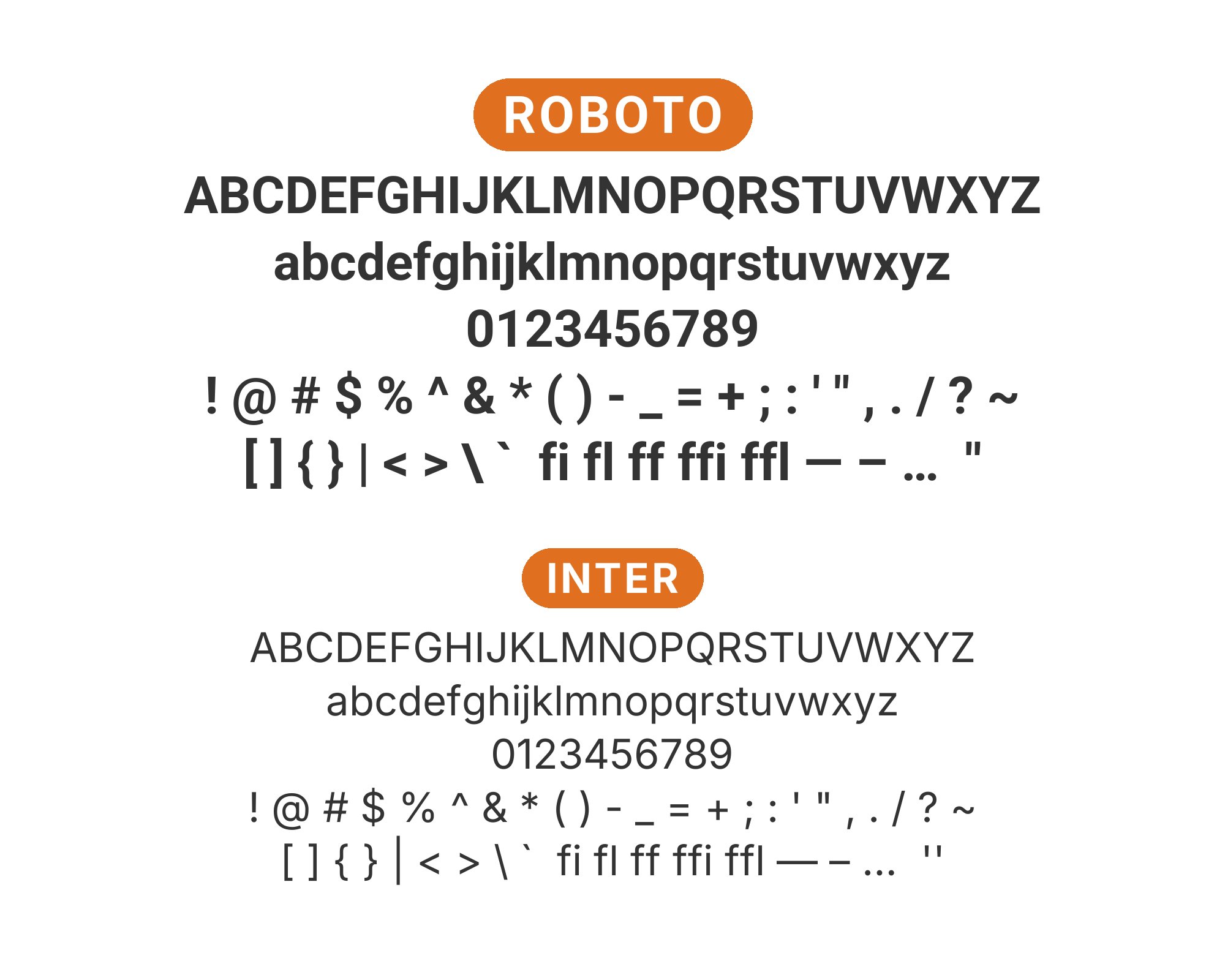
1. Inter
The two titans of interface typography finally meet. Roboto’s friendlier curves, inherited from its Material Design heritage, soften Inter‘s Swiss precision. Both share nearly identical x-heights and cap heights, making them swap seamlessly in component libraries. Use Roboto for the warmth it brings to headlines, Inter for the legibility optimizations it offers at body sizes. This is the pairing that powers half of Silicon Valley’s dashboards, and for good reason: it works everywhere, offends nobody, and reads beautifully.
2. Montserrat

Montserrat and Roboto share geometric ancestry but express it differently. Montserrat carries more personality in its slightly wider proportions and distinctive uppercase characters, while Roboto maintains that familiar Android efficiency. Together they create a modern, approachable system that feels designed rather than defaulted. The key is weight differentiation: Montserrat Bold for headlines, Roboto Regular for body. Marketing sites, creative agencies, and startups wanting personality without risk gravitate here.


3. Playfair Display

This is contrast done right. Playfair Display‘s high-contrast elegance and delicate hairlines create visual fireworks against Roboto’s sturdy geometry. The pairing works because neither font apologizes for what it is: Playfair is unapologetically classical, Roboto unapologetically modern. Use Playfair exclusively for headlines at 32px and up, where its sophistication reads clearly. Below that, Roboto’s optimized letterforms handle the functional work. Fashion editorials, luxury branding, and upscale restaurants understand this pairing intuitively.


4. Open Sans

Predictability as a feature. Both Roboto and Open Sans represent the gold standard of web-safe readability, optimized exhaustively for screen rendering across every device imaginable. Open Sans brings slightly more humanist warmth, Roboto slightly more geometric discipline. Together they create an almost invisible typographic system that never distracts from content. This is the pairing for government sites, healthcare portals, and any platform where accessibility and universal comprehension trump stylistic ambition.


5. Roboto Mono

Family harmony at work. Roboto Mono maintains the proportions and character of its variable-width sibling while adding the fixed-width precision that code requires. Using both together creates a unified visual language where inline code snippets and technical documentation feel native rather than jarring. The shared DNA means colors, weights, and sizes translate predictably across contexts. Developer platforms, technical documentation, and API references need this pairing.


6. Poppins

Geometric meets geometric, but the results feel fresh rather than redundant. Poppins brings rounder terminals and more pronounced ink traps that give it a friendlier, almost playful character against Roboto’s studied neutrality. The two fonts share enough proportional DNA to harmonize, but Poppins’ extra personality prevents monotony. This pairing suits consumer apps, educational platforms, and any product targeting users who want approachability without childishness.


7. Lora

Lora‘s calligraphic warmth is exactly what Roboto’s clinical efficiency needs. Those brushed serifs and gentle curves bring humanity to interfaces that might otherwise feel algorithmic. The x-heights align well enough that transitions from headline to body feel natural, not jarring. This pairing excels in content-first applications where emotional resonance matters: travel blogs, lifestyle publications, memoir collections. Lora tells stories; Roboto serves them up cleanly.


8. Arvo

Slab serifs announce themselves, and Arvo announces with confidence. Its structured, almost architectural forms create strong typographic hierarchy against Roboto’s familiar efficiency. The contrast works because Arvo feels intentional, not accidental. Use Arvo for headlines where its bold personality sets the tone, Roboto for body where readers expect the familiar. This pairing suits creative agencies, architecture firms, and brands wanting strength without aggression.


9. Merriweather

Eben Sorkin designed Merriweather for screens, and its tall x-height and sturdy serifs prove it. Against Roboto’s clean geometry, Merriweather provides the classical contrast that makes typography feel complete. Both fonts prioritize readability at small sizes, making this pairing especially effective for content-heavy platforms. News sites, educational resources, and accessible web applications all benefit from this thoroughly-tested combination.


10. Source Sans Pro

Two fonts designed for UI, sharing a workbench in perfect harmony. Source Sans Pro brings Adobe’s measured approach to screen typography, while Roboto carries Google’s Material Design philosophy. The proportions align so closely that mixing them feels almost seamless. This is the pairing for design systems that need flexibility without discord, enterprise applications where both Google and Adobe aesthetics need to coexist peacefully.


11. Roboto Slab

Sometimes staying in the family makes sense. Roboto Slab extends Roboto’s geometry with sturdy slab serifs that add headline authority without disrupting the visual language. The shared proportions and character shapes mean components transition smoothly from bold headlines to body text. This is the pairing for cohesive design systems, especially in technical or editorial contexts where serif/sans contrast matters but brand consistency matters more.


12. Libre Baskerville

Baskerville’s 18th-century elegance gets a modern foundation with Roboto. Those transitional serifs, refined over centuries of printing, create the kind of typographic authority that Roboto’s youthful geometry lacks. The contrast here is generational: classical wisdom meeting digital fluency. Set Libre Baskerville for headlines where its sophistication commands attention, Roboto for body where its screen optimization shines. Law firms, universities, and heritage brands gravitate toward this pairing.


13. Nunito Sans

Nunito Sans brings rounded terminals that soften Roboto’s more precise geometry. The effect is subtle but significant: interfaces feel friendlier, more approachable, less clinical. Both fonts share humanist proportions, so the combination reads as intentional rather than arbitrary. This pairing works beautifully for consumer products, especially those targeting families, education, or wellness. Warmth without whimsy.


14. Oswald

Condensed headlines demand attention, and Oswald delivers. Its tall, narrow letterforms create dramatic vertical rhythm against Roboto’s more conventional proportions. The contrast here is about space efficiency as much as style: Oswald packs impact into tight header regions while Roboto handles generous body text below. This pairing excels in news layouts, sports applications, and any design where typographic hierarchy needs to punch above its weight.


15. Crimson Text

Renaissance craftsmanship meets Android efficiency. Crimson Text‘s old-style serifs carry centuries of typographic tradition, with diagonal stress and bracketed serifs that feel warmly organic against Roboto’s engineered precision. The pairing works because each font excels in its domain: Crimson for the soul-stirring headlines, Roboto for the clear-headed body work. Literary publications, cultural organizations, and academic presses understand this timeless combination.


Conclusion
There are no absolute rules for font pairing, just principles to guide you. The key is contrast—in weight, in style (serif vs. sans-serif), or in personality. Roboto is versatile enough to play well with many different typefaces.
Trust your eye, experiment freely, and remember that the best pairing is the one that serves your content and audience. Typography should enhance communication, not complicate it.