What fonts go with Proza Libre? This humanist sans-serif with distinctive personality requires pairings that appreciate its quirks rather than trying to neutralize them.
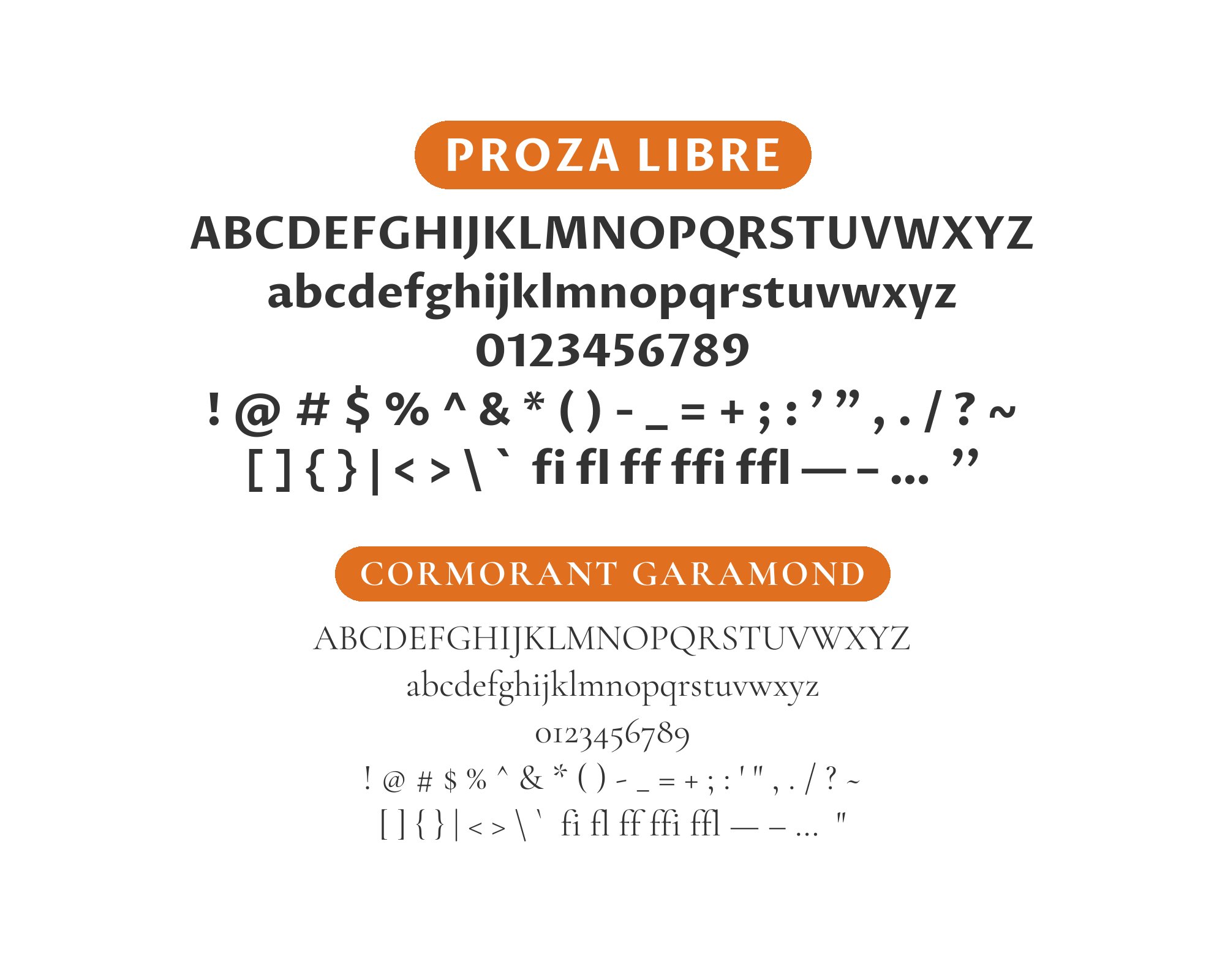
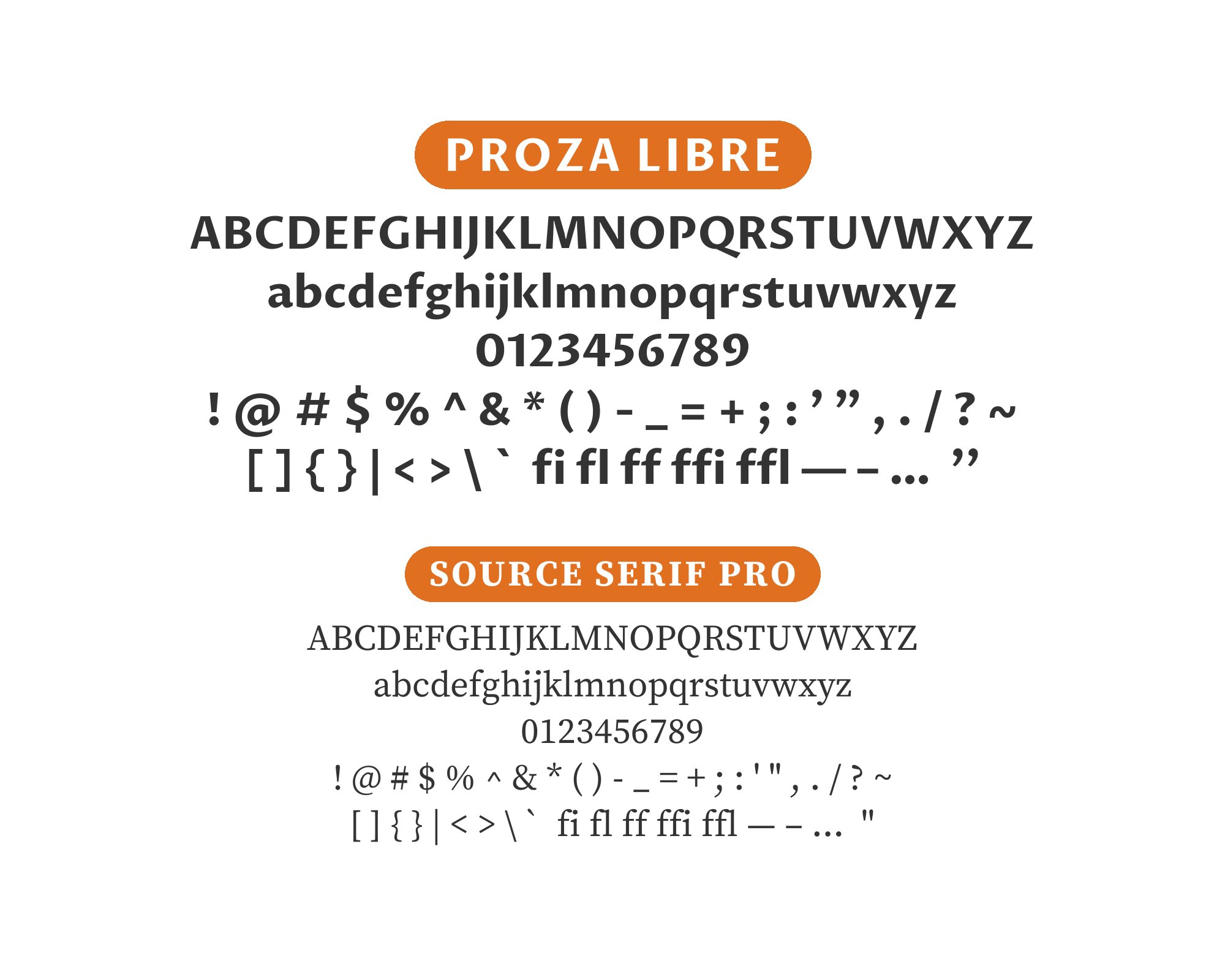
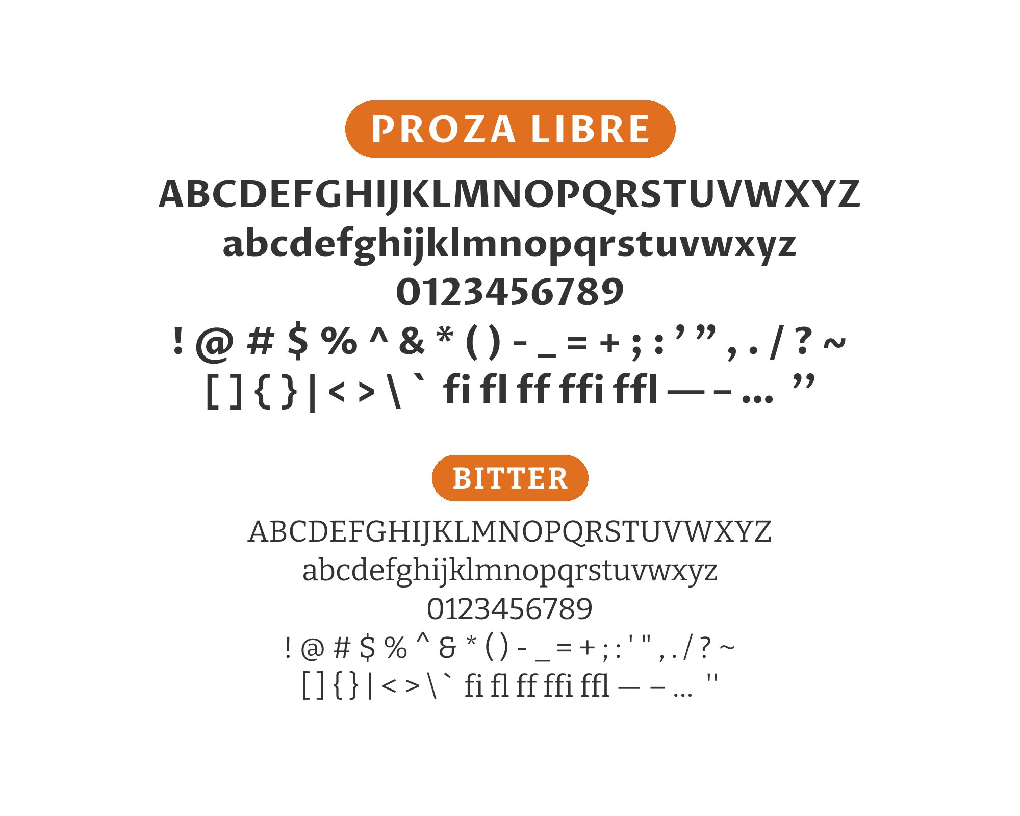
Proza Libre, designed by Jasper de Waard for Bureau Roffa, stands apart from the crowd of clean humanist sans-serifs through its distinctive character. Look closely and you’ll notice unusual details: a lowercase ‘a’ with a distinctive curve, letters with subtle rhythmic variation, and proportions that feel slightly more compressed than typical humanist designs. These idiosyncrasies give text set in Proza Libre a specific flavor, making it memorable while remaining fully functional for body text.
The consideration with Proza Libre pairings is whether to amplify or balance its personality. Neutral companions let its character lead, while fonts with their own distinctive features create rich typographic conversations. The font works particularly well for editorial and publishing contexts where its humanist warmth and readable proportions shine. Here are 15 fonts that pair well with Proza Libre, chosen for how they engage with its distinctive design approach.
1. Cormorant Garamond

Cormorant Garamond‘s elegant high-contrast strokes create headlines with genuine typographic drama. Below, Proza Libre’s humanist proportions and Renaissance-influenced spacing continue the classical theme with sans-serif clarity. This pairing suits literary magazines, publishing houses, or cultural institutions. The shared historical reference points create cohesion while the serif-sans contrast prevents monotony. Sophisticated without pretension.

2. Playfair Display

Playfair‘s theatrical stroke variation and delicate hairlines command attention at headline sizes. Proza Libre’s measured humanist forms provide body text that supports without competing. The combination evokes high-end editorial design, suitable for fashion journalism, art publications, or luxury branding. The dramatic contrast ratio requires careful weight selection, but rewards with refined results.


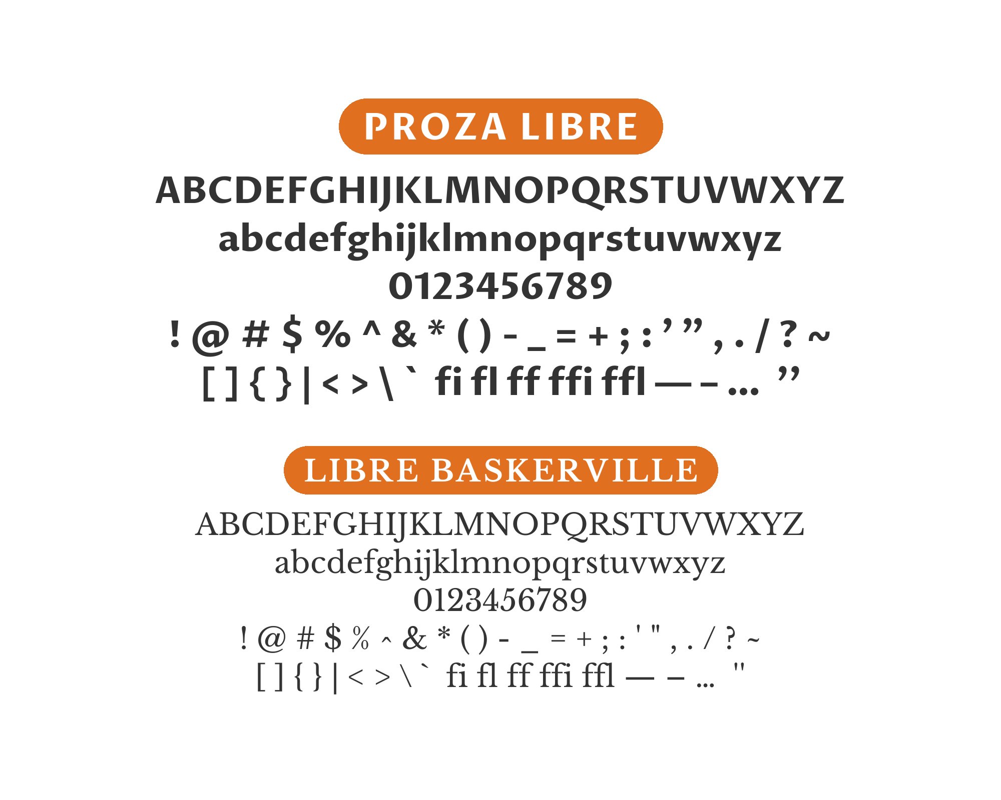
3. Libre Baskerville

Libre Baskerville brings transitional serif authority to headlines, its bracketed curves and moderate contrast signaling tradition. Proza Libre’s Renaissance proportions in body text create temporal harmony despite the classification difference. This pairing works for academic publishing, literary criticism, or heritage brands. The shared emphasis on classical proportions creates unexpected cohesion.

4. Spectral
Both Spectral and Proza Libre were designed for long-form digital reading, making this combination unusually optimized for extended content. Spectral’s refined serifs in headlines lead into Proza Libre’s comfortable humanist body text. Works for ebooks, online magazines, or content platforms prioritizing reading experience. The screen-optimized designs render beautifully across devices and sizes.


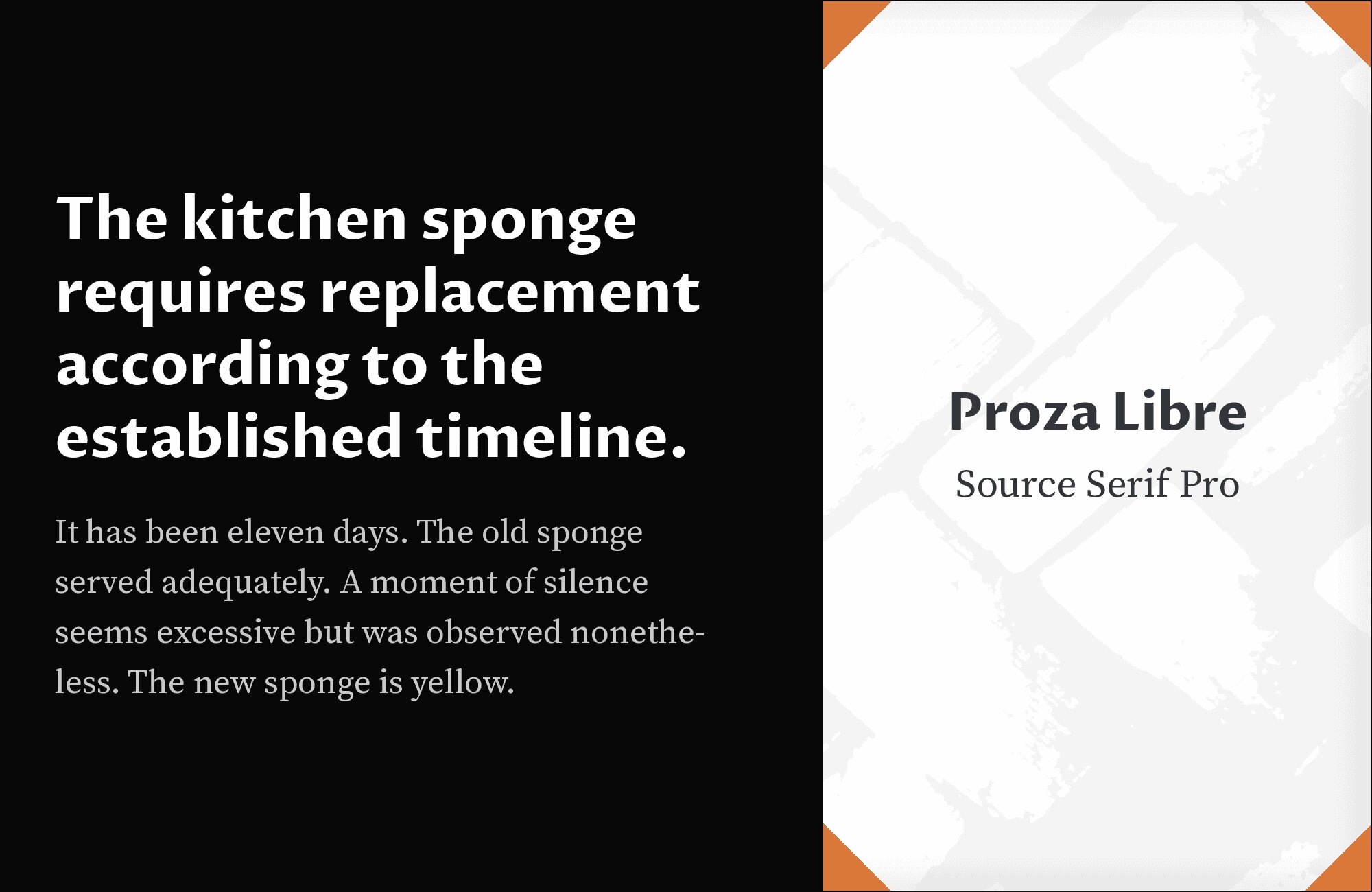
5. Source Serif Pro
Source Serif Pro‘s modern interpretation of transitional forms creates headlines with Adobe’s characteristic clarity. Proza Libre’s humanist sans-serif body text continues the emphasis on readability. This pairing suits documentation, educational content, or publishing platforms. Both fonts prioritize functionality over decoration, creating professional results. The serif headlines add authority while Proza Libre keeps things approachable.
6. Merriweather

Merriweather‘s thick serifs and tall x-height create headlines optimized for screen legibility. Proza Libre’s Renaissance proportions in body text bring classical balance to contemporary contexts. This pairing works for news platforms, educational publications, or long-form journalism. The shared emphasis on comfortable reading texture creates seamless transitions between hierarchy levels.


You'll love this article!
A visual guide for designers.
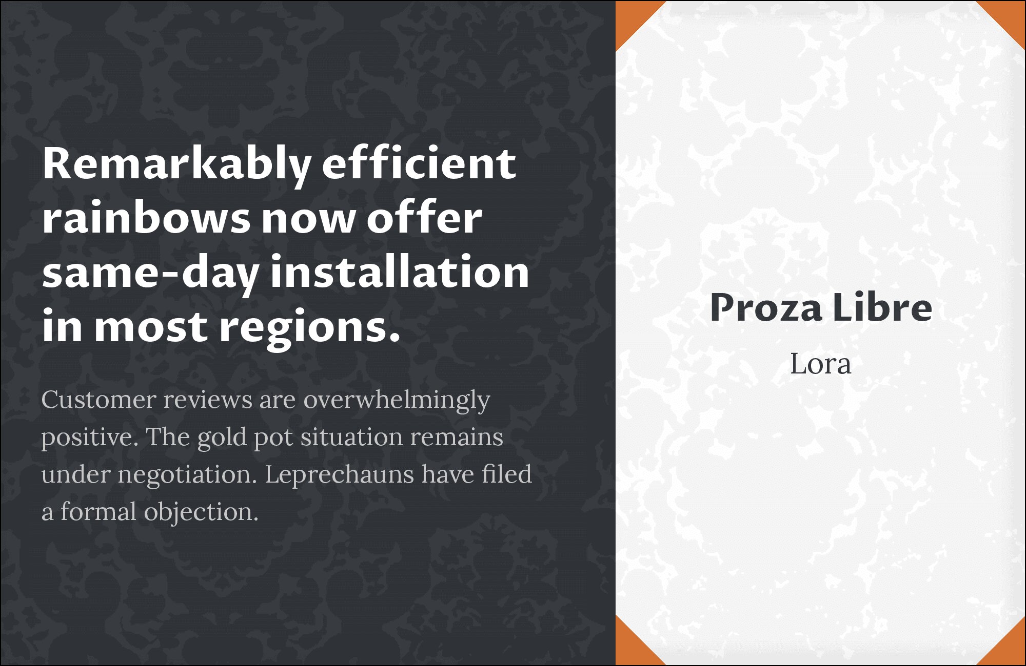
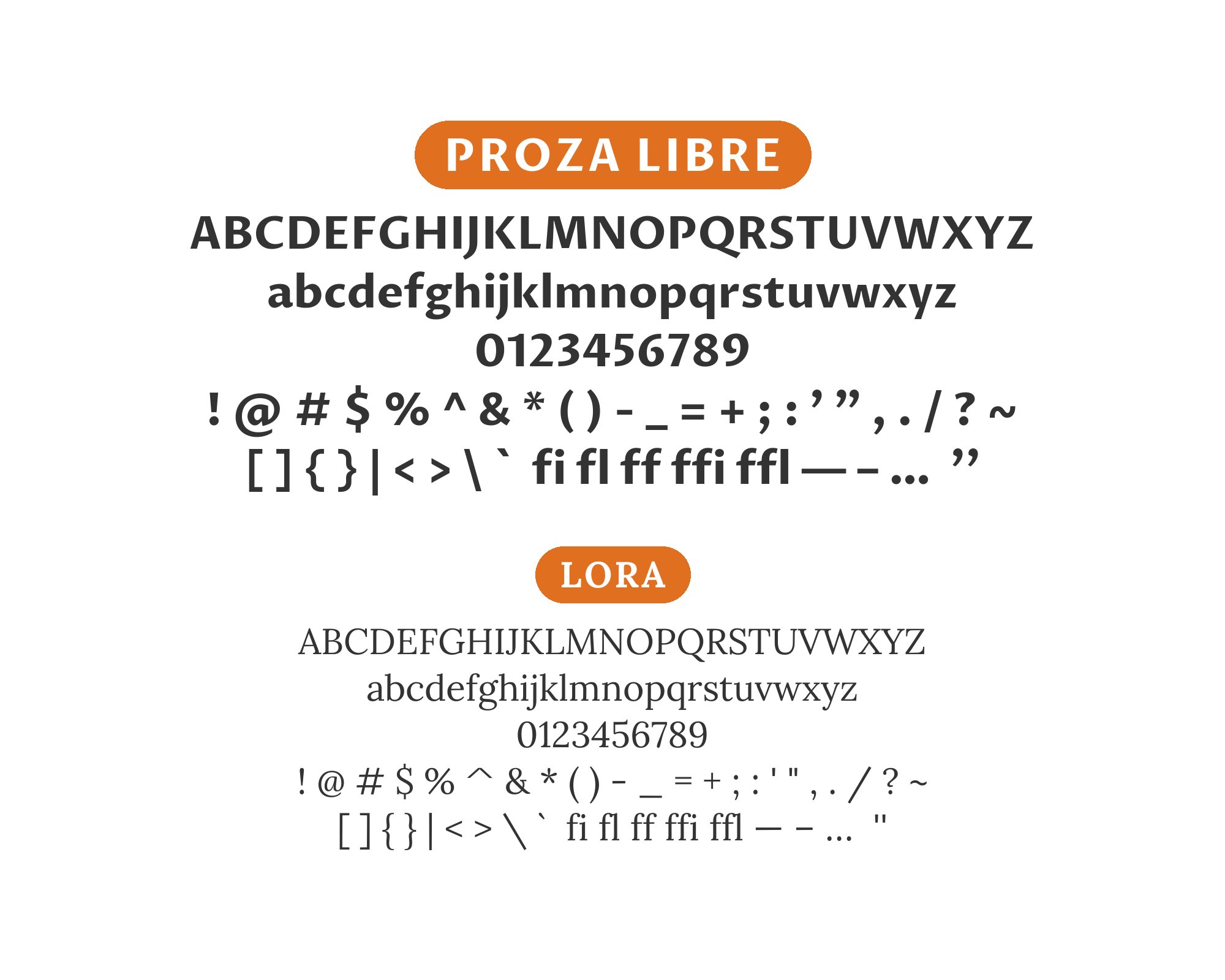
7. Lora
Lora‘s calligraphic influences and soft serifs bring organic warmth to headlines. Proza Libre’s humanist structure continues that approachability with geometric clarity. This combination suits book publishing, cultural journalism, or lifestyle content. Both fonts emphasize readability without sacrificing character. The brush-influenced curves of Lora contrast productively with Proza Libre’s rationalist construction.
8. PT Serif

PT Serif brings Russian typography heritage to headlines through its humanist serifs and comfortable proportions. Proza Libre’s Renaissance-influenced body text creates classical continuity. This pairing works for literary publications, cultural institutions, or heritage brands. The shared emphasis on traditional proportions creates unexpected harmony between serif and sans.


9. EB Garamond

EB Garamond‘s faithful interpretation of sixteenth-century designs brings genuine historical weight to headlines. Proza Libre’s Old Style Renaissance proportions in body text continue the historical theme through sans-serif forms. This combination suits scholarly publishing, literary magazines, or fine art content. The temporal consistency feels intentional rather than accidental.


10. Crimson Text

Crimson Text‘s old-style serif character and subtle stroke variation create headlines with traditional authority. Proza Libre’s humanist body text shares the Renaissance DNA in modernized form. This pairing works for academic journals, literary criticism, or cultural commentary. Both fonts reference similar historical periods, creating cohesion across the serif-sans divide.


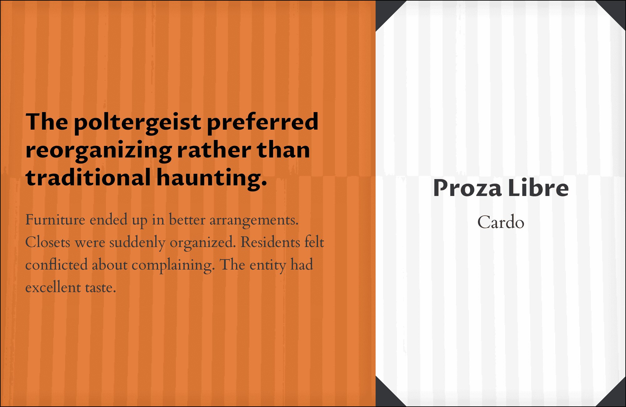
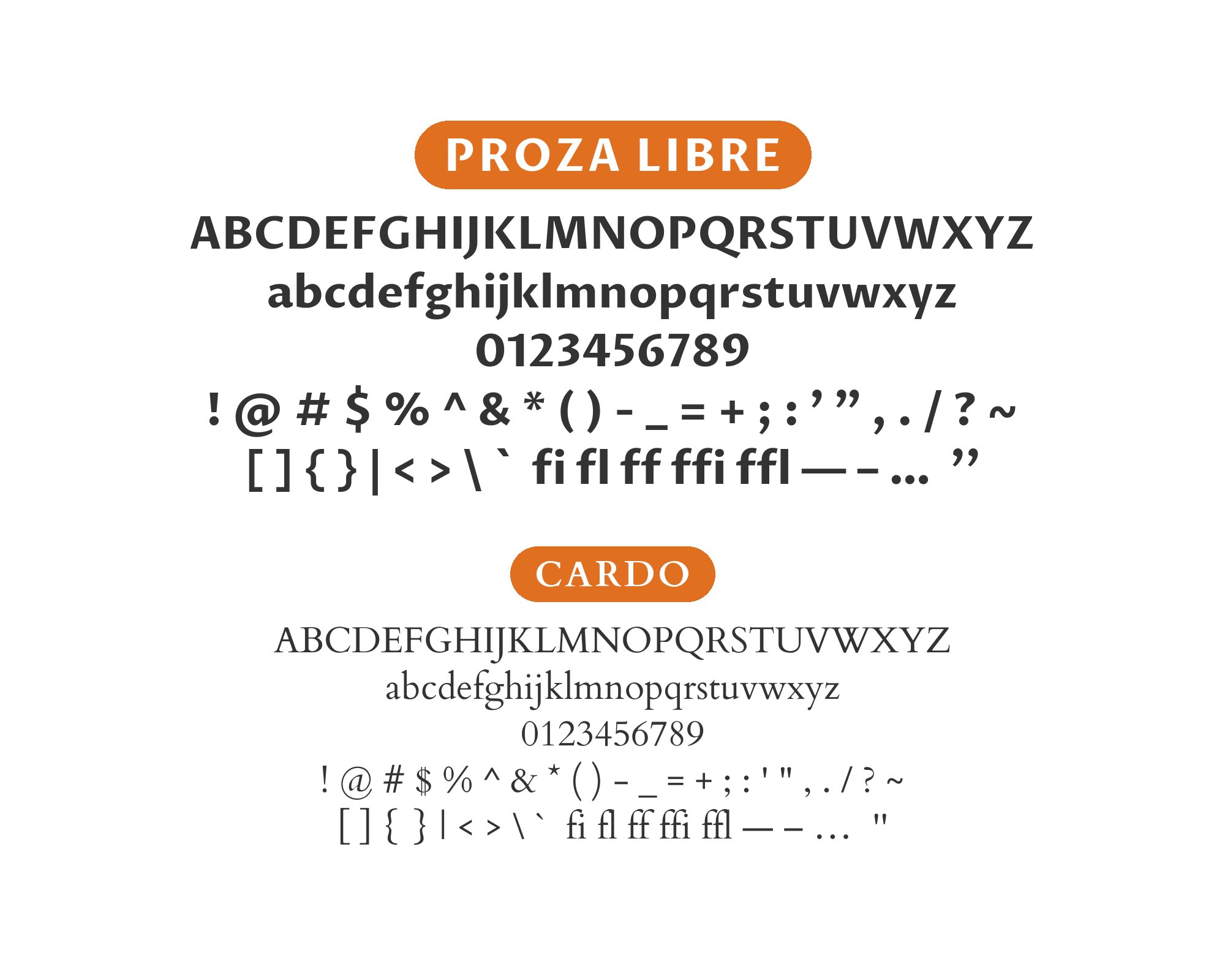
11. Cardo

Cardo‘s scholarly origins and comprehensive glyph coverage create headlines suited to specialized content. Proza Libre’s accessible humanist forms in body text make that content approachable. This combination works for humanities publications, classics departments, or linguistic studies. Cardo handles technical terminology while Proza Libre keeps the surrounding text comfortable.
12. Alegreya

Alegreya‘s dynamic forms and calligraphic DNA bring energy to headlines that Proza Libre’s measured body text can balance. Both fonts share humanist roots, creating underlying cohesion. This pairing suits literary fiction, poetry publications, or cultural magazines. Alegreya’s expressive italics pair particularly well with Proza Libre’s restrained obliques.


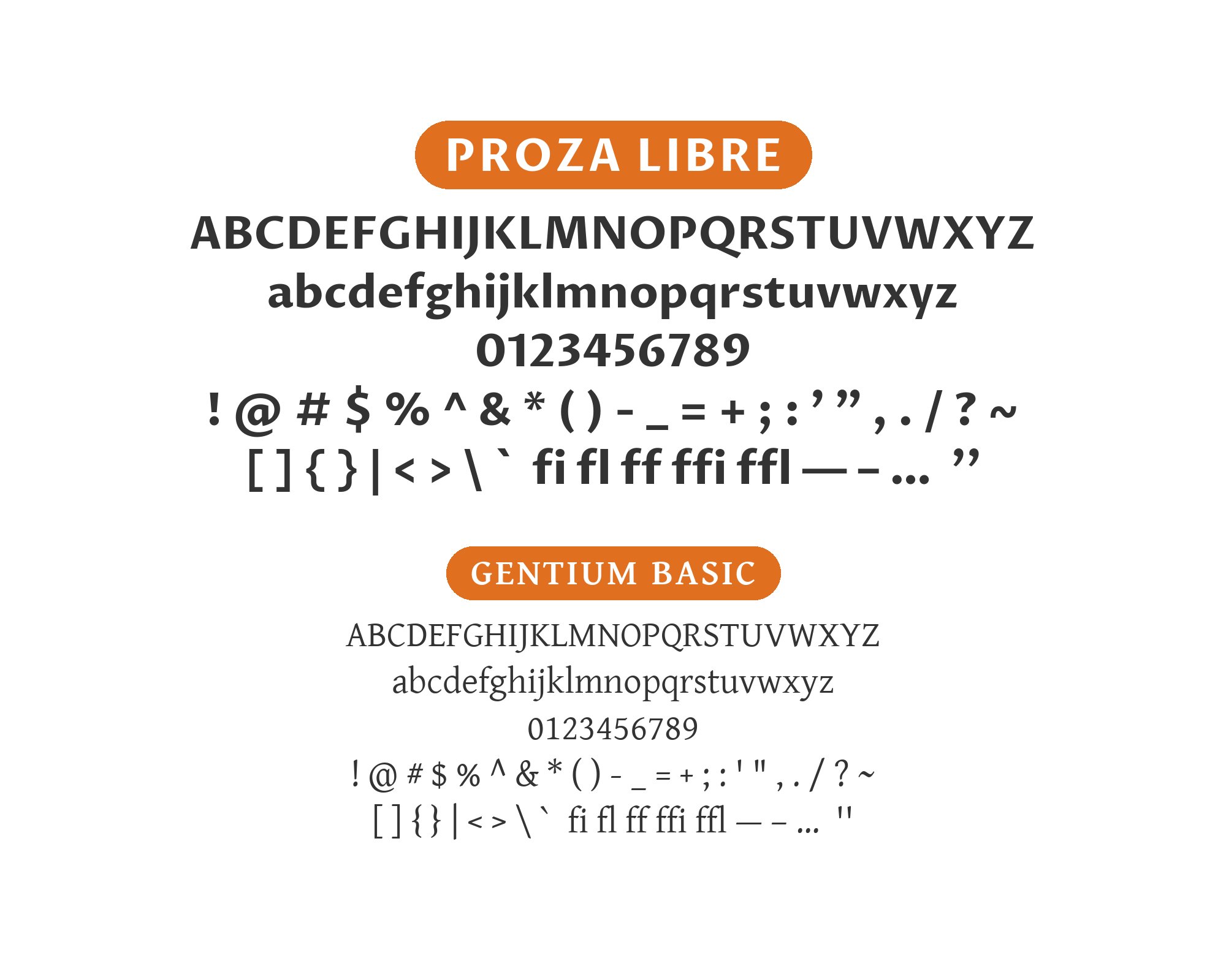
13. Gentium Basic
Gentium Basic‘s extensive language support and scholarly design create globally-aware headlines. Proza Libre’s humanist proportions in body text maintain readability across contexts. This combination suits multilingual publications, academic journals, or international organizations. The shared emphasis on accessibility over decoration creates professional results.
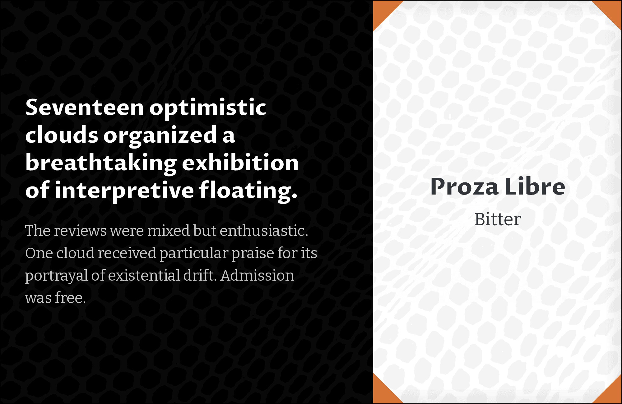
14. Bitter
Bitter‘s slab serifs bring contemporary edge to headlines while retaining readability. Proza Libre’s humanist forms in body text provide classical balance. This pairing works for startup communications, tech journalism, or design publications. The geometric slabs contrast productively with Proza Libre’s organic proportions. Modern but not trendy.
15. Rokkitt

Rokkitt‘s geometric slab construction creates headlines with mechanical precision. Below, Proza Libre’s humanist body text provides organic contrast that prevents coldness. This combination suits tech content, industrial design, or architectural publications. The stark geometric-versus-humanist contrast requires careful weight matching but creates memorable layouts.


Conclusion
There are no absolute rules for font pairing, just principles to guide you. The key is contrast—in weight, in style (serif vs. sans-serif), or in personality. Proza Libre is versatile enough to play well with many different typefaces.
Trust your eye, experiment freely, and remember that the best pairing is the one that serves your content and audience. Typography should enhance communication, not complicate it.