
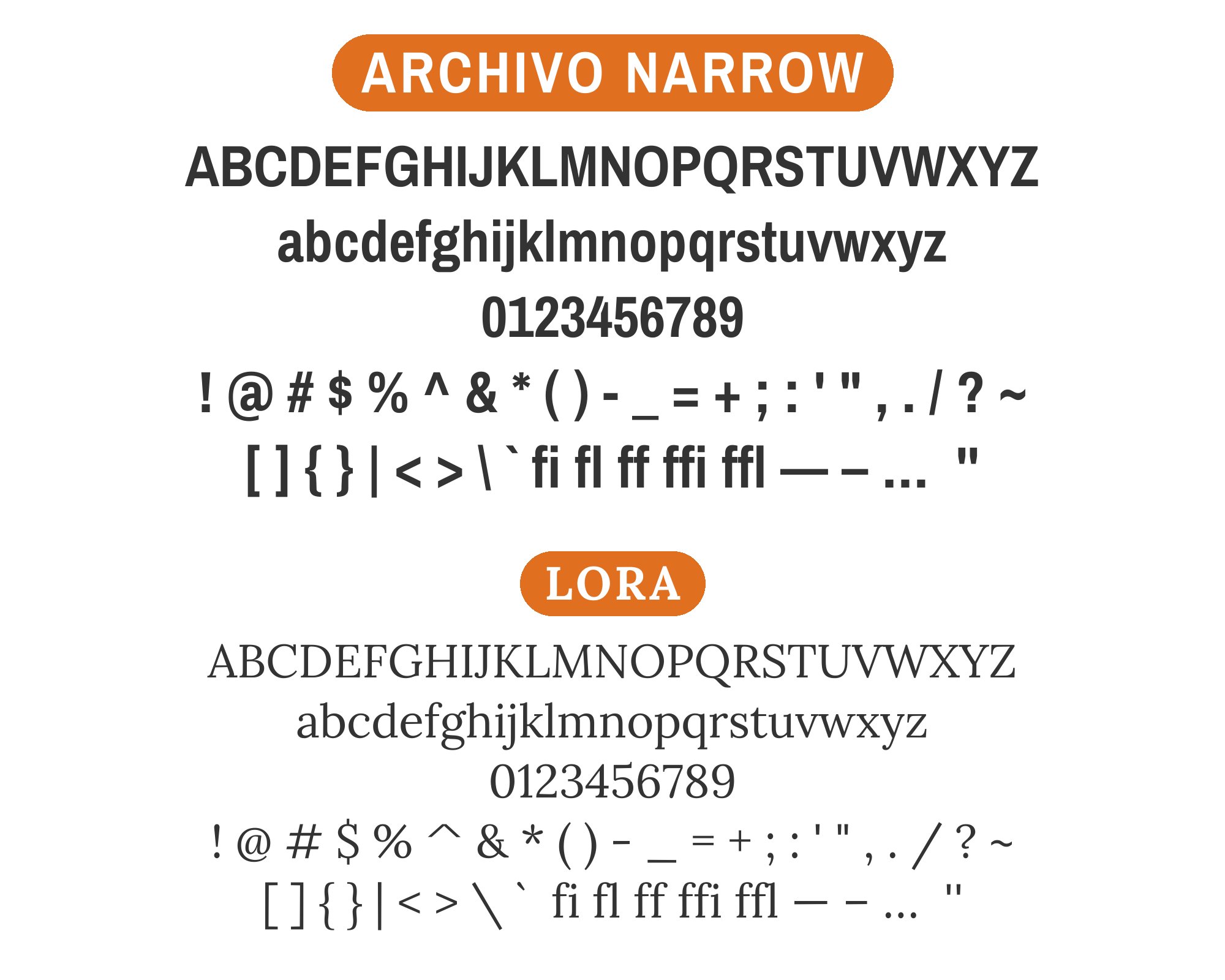
What fonts go with Archivo Narrow? This compact, condensed sans-serif presents a unique challenge: its narrow proportions and slightly industrial character demand pairings that complement its space-efficient nature without creating visual tension.
Archivo Narrow emerged from the Omnibus-Type foundry as part of the larger Archivo family, designed specifically for situations where horizontal space is at a premium. Its tall x-height and open apertures ensure readability even at smaller sizes, while its slightly squared terminals give it a contemporary, no-nonsense feel that works beautifully in headlines, navigation, and data-dense interfaces. The font walks a careful line between being condensed enough to save space and open enough to remain inviting.
Pairing with Archivo Narrow means finding fonts that can either match its efficient character or provide deliberate contrast through width and style. Serif companions need enough presence to hold their own against its vertical emphasis, while other sans-serifs should offer visual distinction without competing for the same narrow lane. Here are 15 fonts that pair well with Archivo Narrow, each bringing something different to the partnership.
1. Tenor Sans

Archivo Narrow hits headlines like a streamlined sports car, all efficiency and forward momentum. Pair it with Tenor Sans in body text and you get breathing room without sacrificing sophistication. The lighter stroke weight of Tenor Sans acts as a visual exhale after Archivo’s compressed intensity. Together they work for fashion editorials, architectural portfolios, or any project where space is at a premium but elegance is not. The contrasting x-heights create a comfortable reading rhythm while maintaining a unified modernist sensibility.


2. Libre Baskerville

This pairing plays the old game of classic meets contemporary, but does it with real conviction. Libre Baskerville‘s transitional serifs and bracketed curves bring 300 years of typographic heritage into your body copy. Up top, Archivo Narrow’s space-saving condensed forms feel almost aerodynamic by comparison. Use this combination for literary magazines or museum catalogs where you need to signal tradition without looking dusty. The contrast in stroke modulation creates visual tension that keeps pages alive.


3. Cormorant

Cormorant‘s high-contrast strokes and delicate hairlines make it the prima ballerina of body text, while Archivo Narrow plays the supporting role with muscular restraint. The serif’s classical proportions recall Garamond, but with sharper edges suited to screen rendering. When these two meet, you get an art house aesthetic that works equally well for wine labels or gallery announcements. The dramatically different stroke weights prevent monotony while the shared emphasis on verticality creates cohesion.


4. PT Serif

PT Serif brings warmth to the table like a well-worn leather armchair, its humanist curves softening Archivo Narrow’s industrial efficiency. The pairing feels approachable yet professional, making it ideal for corporate communications that need to feel human. PT Serif’s generous x-height matches well with Archivo’s tall lowercase letters, creating smooth transitions between headlines and body text. Think annual reports, nonprofit newsletters, or any context where you need authority without coldness.


5. Playfair Display

Playfair‘s theatrical hairline strokes and ball terminals command attention like a chandelier, making Archivo Narrow’s restrained condensed forms feel almost humble in comparison. This high-drama pairing works when you want to signal luxury without excess. The contrast ratio between thick and thin strokes in Playfair creates visual sparkle, while Archivo keeps headlines efficient and scannable. Best for hospitality brands, wedding stationery, or editorial spreads that need to feel curated.


6. Poppins

Two geometric sans-serifs walk into a bar, but somehow it works. Poppins brings circular bowl shapes and consistent stroke weights that contrast with Archivo’s compressed rectangles. The effect is modern tech meets editorial efficiency. Use this pairing for SaaS marketing sites or startup pitch decks where you need energy without chaos. Both fonts render crisply on screens, and their shared geometric DNA keeps the overall aesthetic cohesive despite their structural differences.


You'll love this article!
A visual guide for designers.
7. Roboto

Google’s workhorse font provides the neutral, flexible body copy that lets Archivo Narrow’s condensed headlines do the heavy lifting. Roboto‘s grotesque skeleton with slightly rounded terminals creates just enough personality to avoid sterility. This pairing screams contemporary digital design without trying too hard. Works beautifully for news sites, documentation, or any content-heavy application where efficient space usage matters. The matched x-heights create seamless visual flow.


8. Julius Sans One

Julius Sans One brings a whisper where Archivo brings a shout. Its fine strokes and elegant proportions create subheadings that feel almost engraved, while Archivo’s bold weights punch through noise. Together they evoke art deco poster design translated for modern screens. Use sparingly for fashion or lifestyle content where restraint signals sophistication. The contrast in stroke weight is dramatic, so careful hierarchy planning is essential.


9. Archivo Black

Same family, different temperament. Archivo Black takes the condensed DNA and cranks it to maximum density, creating headlines with real gravitational pull. When body text needs to match, regular Archivo Narrow keeps the conversation in the same visual language. This monofamily approach works for sports brands, entertainment marketing, or anywhere you need impact without typographic discord. The shared proportions make scaling between weights seamless.


10. Source Sans Pro

Adobe’s first open-source typeface was designed for UI clarity, and that legibility-first approach harmonizes with Archivo Narrow’s pragmatic condensed forms. Both fonts prioritize reading efficiency over decorative flourish. The combination feels like it belongs on a well-designed government website or educational platform. Source Sans Pro‘s slightly humanist curves add just enough warmth to balance Archivo’s industrial edge. Clean, clear, and utterly professional.


11. Lora

Lora‘s brushed curves and calligraphic DNA bring organic energy to body text, creating contrast against Archivo Narrow’s mechanical precision. The serif’s generous spacing and comfortable reading texture makes long-form content inviting. This pairing works for literary journals, book publishers, or cultural institutions. Lora’s soft serifs and Archivo’s sharp corners create productive visual tension. The weight matching requires attention, but rewards with sophisticated results.

12. Open Sans
Open Sans might be ubiquitous, but that’s because it does everything competently. Paired with Archivo Narrow’s space-saving headlines, you get a combination that works across devices and contexts without visual drama. This is the reliable sedan of font pairings, perfect for corporate websites, healthcare communications, or educational materials. Open Sans’s humanist touches soften Archivo’s efficiency. Sometimes boring is exactly what you need.

13. Merriweather

Merriweather‘s tall x-height was designed for screen legibility, and it delivers. Those thick serifs and open letterforms make body text readable even at small sizes. Combined with Archivo Narrow’s condensed headlines, you get maximum content density without sacrificing comfort. The pairing suits news organizations, academic publications, or content platforms. The shared emphasis on x-height creates visual harmony despite the serif-sans contrast.


14. Crimson Text

Crimson Text brings old-style elegance with Renaissance proportions and subtle stroke variation. Against Archivo Narrow’s modernist compression, it creates a dialogue between centuries. This pairing works for publishers, cultural magazines, or any project that needs to balance tradition with efficiency. Crimson’s italic cuts are particularly beautiful for pull quotes. The contrast in historical DNA keeps things interesting without creating conflict.


15. EB Garamond

EB Garamond might be the most faithful digital interpretation of Claude Garamond’s sixteenth-century designs. Its organic stroke variation and elegant proportions bring genuine historical weight. Archivo Narrow’s condensed sans-serif forms create temporal contrast that feels intentional rather than accidental. Use this pairing for academic presses, wine labels, or luxury publishing. The combination speaks to readers who appreciate typographic heritage but demand modern efficiency.


Conclusion
There are no absolute rules for font pairing, just principles to guide you. The key is contrast—in weight, in style (serif vs. sans-serif), or in personality. Archivo Narrow is versatile enough to play well with many different typefaces.
Trust your eye, experiment freely, and remember that the best pairing is the one that serves your content and audience. Typography should enhance communication, not complicate it.