BonFX

Typography & Graphic Design Blog

  • Blog
  • Font Combinations
  • Books
    • The Preposterously Huge Book of Google Font Combinations
    • The Big Book of Font Combinations (Classic Fonts Edition)
  • Contact
You are here: Home / Graphic Design / FreeHand / FreeHand Perspective Grid: Editable Artwork in Perspective

The BonFX Letter

One good pairing.
Every Tuesday.

2-minute read · free

This week — no. 14

Quiet authority

Merriweather sets the tone in one line. Lato stays out of the way and lets it.

MERRIWEATHER 700  +  LATO 400

A font specimen, a pairing that works, and one line on why it works. That is the whole email.

Free. One click to unsubscribe. No sharing, ever.

FreeHand Perspective Grid: Editable Artwork in Perspective

September 20, 2026 by Douglas Bonneville

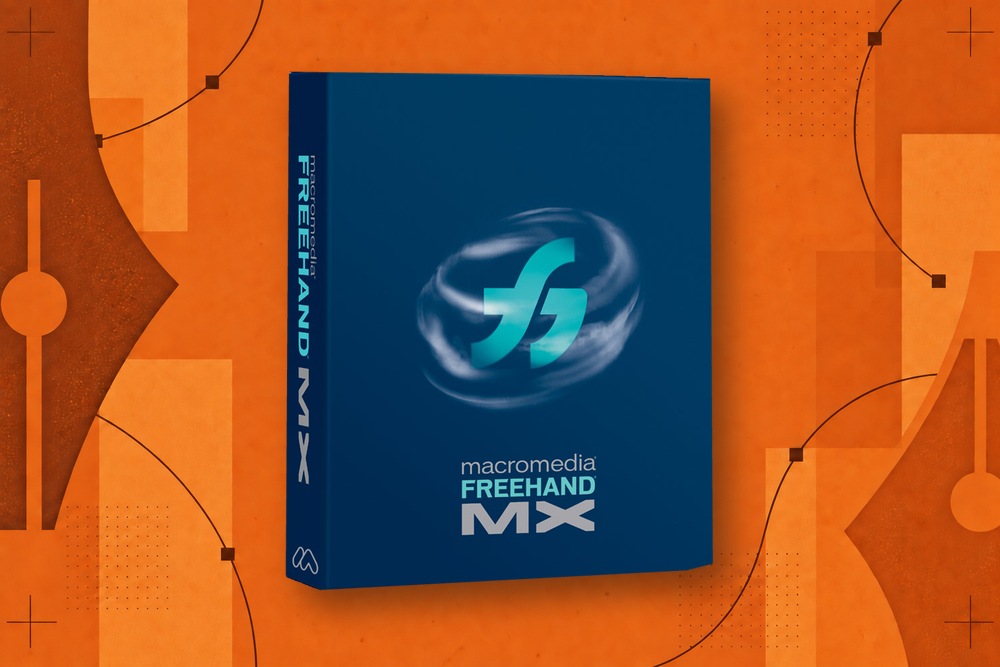
Macromedia FreeHand MX package on an orange field of vector paths, pen nibs, anchor points, and print texture

A logo can look correct on its own and wrong on the side of a drawn box. The problem is no longer the logo’s shape. It is the relationship between that shape and the plane carrying it.

FreeHand’s perspective grid gave designers a way to establish that relationship. Instead of repeatedly guessing at skew and scale, they could place artwork into a perspective system and adjust it there.

Adobe’s historical tutorial demonstrates foreshortened objects and editable text. The MX manual, in the perspective sections of chapter 7, describes the related controls and release behavior.

For the application’s larger history, see what happened to Macromedia FreeHand.

A grid supplies a common reference

Draw a storefront with two visible sides. Lettering on the left wall and a poster on the right wall should obey the same spatial construction. If you distort them independently by eye, each may look plausible while the combined scene feels inconsistent.

A perspective grid provides shared planes and vanishing-point relationships. The artwork becomes part of that system rather than a set of unrelated distortions.

This is still a two-dimensional drawing technique. It does not turn the illustration into a complete three-dimensional model with physical lighting, materials, or a freely rotating camera.

The useful part was revision

A one-time perspective transformation is easy to admire in a demonstration. Production value appears when the client changes the lettering.

If the text remains editable, the designer can revise the words while retaining the intended spatial relationship. If it has become outlines, changing the wording is a reconstruction task.

FreeHand documented editing text attached to the grid through its Text Editor. It also documented a limit: releasing text while retaining perspective converts it to grouped paths. The appearance can survive while text editability does not.

That distinction belongs in every explanation of the feature. “Live text in perspective” should never imply that every subsequent operation preserves live text.

A useful demonstration

Start with a simple box, a short name, and a striped label. Put the name on one side and the label on the other. Move each along its plane. Then change the name to a longer word.

The test is whether you can maintain the relationship without beginning again. It also reveals practical constraints: text spacing, clipping, the readability of narrow shapes, and how much manual adjustment is still appropriate after the geometric transformation.

Perspective can be mathematically consistent while looking poor at the intended size. A designer still has to judge the result.

How to compare modern tools

Ask what the application means by perspective. A grid, an envelope, a free transform, and a three-dimensional extrusion may all produce something that looks spatial. Their editing models are different.

For a fair comparison, use the same sequence:

  • Establish two planes.
  • Place a piece of artwork on each.
  • Reposition one without changing the overall construction.
  • Edit any text.
  • Save and reopen.
  • Export and inspect the result elsewhere.

Do not assume that a similar-looking initial result guarantees the same revision behavior. Also avoid treating FreeHand’s historical implementation as the only legitimate solution. A modern tool may reach the needed outcome through a different, equally useful model.
Macromedia FreeHand MX package inside a circle of orange vector-design artwork

Does a revival need this on day one?

Not necessarily.

For a designer creating packaging mockups or architectural lettering, perspective may be central. For someone returning to FreeHand-style logo drawing and short layouts, clipping, selection, text, saving, and reliable export may be more urgent.

Backhand’s current scope treats perspective as deferred work. That is a sensible priority only if the product description remains clear about the selected workflows being rebuilt. It would be misleading to describe a complete MX replacement and quietly omit the operation.

The revival requirements article distinguishes essential foundations from later historical parity.

Perspective is one part of FreeHand’s broader feature set. It is especially revealing because it shows the recurring question behind the program’s appeal: how much of a design can remain open to change after it starts looking finished?

About Douglas Bonneville

Douglas has been a graphic designer since 1992, in addition to software developer and author. He is a member of Smashing Magazine's "Panel of Experts" and has contributed to over 100 articles. He is the author of "The Big Book of Font Combinations", loves cats, and plays guitar.

The BonFX Letter

One good pairing.
Every Tuesday.

2-minute read · free

This week — no. 14

Quiet authority

Merriweather sets the tone in one line. Lato stays out of the way and lets it.

MERRIWEATHER 700  +  LATO 400

A font specimen, a pairing that works, and one line on why it works. That is the whole email.

Free. One click to unsubscribe. No sharing, ever.

Free download

The Typography Primer.
Yours, right now.

Adobe's classic · PDF · free

The Typography Primer — book cover

The guide to type that everyone learned from. Subscribe and it is yours instantly. The BonFX Letter follows.

Free. One click to unsubscribe. No sharing, ever.

Still Googling UX terms?

Stop. They're all right here.

UX for Cats book cover

50 terms. Illustrated.
So simple your cat gets it.

Get the Book →

Print & ePub on Amazon

350 font combinations you can steal.

The Big Book of Font Combinations

Every pairing shown in context — web, print, headings, body. Open it, find one that works, use it.

That's it. That's the book.

In print or ePub 40% OFF on Gumroad

Scrolling Google Fonts for "the right one"?

You've been at it for 20 minutes. You'll be at it for 20 more. There are 1,500 fonts in there.

Pocket Handbook of Google Fonts Combinations

We paired every useful Google Font.
7,500 pages. Done.

Get the PDF →

Instant download on Gumroad

Recent Inspirations

  • What Would a FreeHand Revival Actually Require? September 20, 2026
  • Backhand: Bringing FreeHand-Inspired Workflows to the Browser September 20, 2026
  • Moving from FreeHand to Modern Vector Tools: A Workflow Translation Guide September 20, 2026
  • Can You Still Run FreeHand MX? A Guide for Modern Computers September 20, 2026
  • Free FreeHand: The Campaign and Lawsuit to Save a Design App September 20, 2026
  • How to Open and Convert Old FreeHand Files September 20, 2026
  • Macromedia FreeHand Alternatives: Which Workflow Do You Need Back? September 20, 2026
  • Adobe, FreeHand, and the FTC: Two Acquisitions, Two Different Outcomes September 20, 2026
  • FreeHand Typography: Where Illustration Met Page Layout September 20, 2026
  • Clone, Subselect, and Shortcuts: Why FreeHand Felt Fast September 20, 2026
  • FreeHand Perspective Grid: Editable Artwork in Perspective September 20, 2026
  • FreeHand Find & Replace Graphics: Editing a Whole Document at Once September 20, 2026
  • FreeHand Multiple Pages: The Workspace Designers Still Remember September 20, 2026
  • FreeHand Paste Inside: How It Worked and What Replaces It September 20, 2026
  • FreeHand vs. Illustrator: Why Their Workflows Felt Different September 20, 2026

About BonFX

Douglas Bonneville has been a graphic designer since 1992 and has written about type here since 2009. BonFX is a blog about typography and design, and the books that came out of it.

  • The Big Book of Font Combinations
  • The Preposterously Huge Book of Google Font Combinations
  • UX for Cats

More about BonFX →

Start Here

  • Font Combinations: The Complete Guide
  • The 100 Best Fonts
  • 17 Types of Fonts
  • 29 Principles for Great Font Combinations
  • 23 Really Bad Font Choices
  • 20 Free Google Wedding Font Combinations

Contact

Questions about the books or the site? Contact us.

Follow @dbonneville on X.

The BonFX Letter: one good pairing every Tuesday, free. The signup is in the sidebar of every page.

Copyright © 2026 · BonFX

  • Blog
  • Font Combinations
  • Books
    • The Preposterously Huge Book of Google Font Combinations
    • The Big Book of Font Combinations (Classic Fonts Edition)
  • Contact