BonFX

Typography & Graphic Design Blog

  • Blog
  • Font Combinations
  • Books
    • The Preposterously Huge Book of Google Font Combinations
    • The Big Book of Font Combinations (Classic Fonts Edition)
  • Contact
You are here: Home / Graphic Design / FreeHand / FreeHand Multiple Pages: The Workspace Designers Still Remember

The BonFX Letter

One good pairing.
Every Tuesday.

2-minute read · free

This week — no. 14

Quiet authority

Merriweather sets the tone in one line. Lato stays out of the way and lets it.

MERRIWEATHER 700  +  LATO 400

A font specimen, a pairing that works, and one line on why it works. That is the whole email.

Free. One click to unsubscribe. No sharing, ever.

FreeHand Multiple Pages: The Workspace Designers Still Remember

September 20, 2026 by Douglas Bonneville

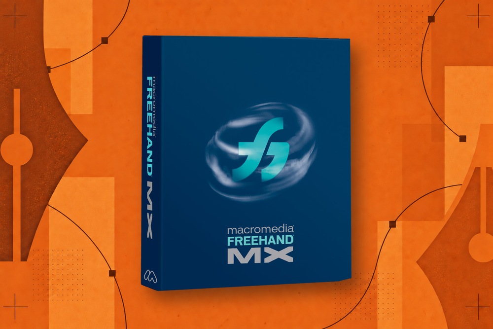
Macromedia FreeHand MX package on an orange field of vector paths, pen nibs, anchor points, and print texture

A business card looks fine until you place it beside the letterhead. Then the logo feels too large, the rule too heavy, or the spacing inconsistent.

That comparison is part of design. A workspace can make it immediate, or it can turn it into a ritual of opening files and arranging windows.

FreeHand’s multipage environment made related compositions available on one pasteboard. Different page sizes could coexist, and the designer could arrange pages while working. That combination helps explain its appeal to people whose projects crossed the boundary between illustration and layout.

The larger FreeHand story is often told through acquisition dates. This is one of the workflows those dates interrupted.

Pages were useful working objects

In the MX manual, chapter 2 treats page setup as an active part of the job. The Document panel includes page size, orientation, bleed, and page thumbnails. Pages can be selected, added, resized, and positioned.

Think of three independent questions:

  • What area will become an output page?
  • Where does that page sit while you are designing?
  • Which artwork belongs with it when it moves?

Those questions are often collapsed into a single idea of “the document.” Keeping them distinct gives a designer more control.

A page can be a destination for a finished piece without becoming a wall that prevents comparison with the rest of the project.

A practical identity-system example

Start with a letterhead, a card, and an envelope. Keep a few unused logo variations on the pasteboard. The artwork is still being developed, so it is helpful to move a variation into a real composition rather than judge it in isolation.

When the symbol changes, compare the three pieces again. Check how it behaves at the smallest size. Check whether the envelope has too much visual weight relative to the letterhead. The workspace supports those judgments because the pieces remain nearby.

This is a design example, not a claim that every asset automatically updates throughout the document. Reuse depends on how the artwork is structured. Independent copies remain independent; shared symbols or styles establish different relationships.

Master pages solved a different problem

Multiple pages organize variety. Master pages organize repetition.

The manual’s master-page section begins on page 50. It describes reusable page attributes and artwork, multiple masters within one document, and applying them to child pages. A repeating header or background can therefore have a maintained source instead of several visually similar copies.

That distinction matters in any successor. A program with ten page rectangles has implemented multipage space. It has not necessarily implemented inheritance, exceptions, and updates from a master.

A revival should name those capabilities separately so that “multiple pages” does not become an inflated claim.

The pasteboard is not the delivery file

A working arrangement can be intentionally loose. A printer or recipient needs something more definite.

Before delivery, check output order, dimensions, bleed, off-page objects, and which pages are included. Keep a proof of the exported result. The visual convenience of a shared pasteboard does not remove the need to verify the file that leaves the application.

This becomes especially important when moving artwork between tools. Page metadata and artwork geometry are not the same thing. A receiving application might preserve the drawing while arranging pages differently—or interpret a multipage file as one large drawing.

The file-conversion guide explains why page count belongs on the fidelity checklist.
Macromedia FreeHand MX package inside a circle of orange vector-design artwork

Modern alternatives have changed the comparison

It would be misleading to say FreeHand is the only vector editor with multiple pages. Inkscape’s own documentation records multipage support from version 1.2, using application-specific information inside SVG. Inkscape’s explanation also illustrates why a format label alone does not guarantee equivalent page behavior elsewhere.

CorelDRAW’s current page documentation describes page sizing and movement in multipage view. Illustrator users have artboards. The comparison today should examine details rather than award a point for the presence of a second page.

Can you move a page and its artwork together? Can you preserve repeated elements? Are exports predictable? Can you work comfortably when pages overlap or vary greatly in size?

Backhand now has page-management implementation, but that should not be confused with complete publishing behavior. The project story separates what is implemented from what still needs work. The revival requirements make that distinction central: preserve the useful workspace, then prove that its documents remain trustworthy.

About Douglas Bonneville

Douglas has been a graphic designer since 1992, in addition to software developer and author. He is a member of Smashing Magazine's "Panel of Experts" and has contributed to over 100 articles. He is the author of "The Big Book of Font Combinations", loves cats, and plays guitar.

The BonFX Letter

One good pairing.
Every Tuesday.

2-minute read · free

This week — no. 14

Quiet authority

Merriweather sets the tone in one line. Lato stays out of the way and lets it.

MERRIWEATHER 700  +  LATO 400

A font specimen, a pairing that works, and one line on why it works. That is the whole email.

Free. One click to unsubscribe. No sharing, ever.

Free download

The Typography Primer.
Yours, right now.

Adobe's classic · PDF · free

The Typography Primer — book cover

The guide to type that everyone learned from. Subscribe and it is yours instantly. The BonFX Letter follows.

Free. One click to unsubscribe. No sharing, ever.

Still Googling UX terms?

Stop. They're all right here.

UX for Cats book cover

50 terms. Illustrated.
So simple your cat gets it.

Get the Book →

Print & ePub on Amazon

350 font combinations you can steal.

The Big Book of Font Combinations

Every pairing shown in context — web, print, headings, body. Open it, find one that works, use it.

That's it. That's the book.

In print or ePub 40% OFF on Gumroad

Scrolling Google Fonts for "the right one"?

You've been at it for 20 minutes. You'll be at it for 20 more. There are 1,500 fonts in there.

Pocket Handbook of Google Fonts Combinations

We paired every useful Google Font.
7,500 pages. Done.

Get the PDF →

Instant download on Gumroad

Recent Inspirations

  • What Would a FreeHand Revival Actually Require? September 20, 2026
  • Backhand: Bringing FreeHand-Inspired Workflows to the Browser September 20, 2026
  • Moving from FreeHand to Modern Vector Tools: A Workflow Translation Guide September 20, 2026
  • Can You Still Run FreeHand MX? A Guide for Modern Computers September 20, 2026
  • Free FreeHand: The Campaign and Lawsuit to Save a Design App September 20, 2026
  • How to Open and Convert Old FreeHand Files September 20, 2026
  • Macromedia FreeHand Alternatives: Which Workflow Do You Need Back? September 20, 2026
  • Adobe, FreeHand, and the FTC: Two Acquisitions, Two Different Outcomes September 20, 2026
  • FreeHand Typography: Where Illustration Met Page Layout September 20, 2026
  • Clone, Subselect, and Shortcuts: Why FreeHand Felt Fast September 20, 2026
  • FreeHand Perspective Grid: Editable Artwork in Perspective September 20, 2026
  • FreeHand Find & Replace Graphics: Editing a Whole Document at Once September 20, 2026
  • FreeHand Multiple Pages: The Workspace Designers Still Remember September 20, 2026
  • FreeHand Paste Inside: How It Worked and What Replaces It September 20, 2026
  • FreeHand vs. Illustrator: Why Their Workflows Felt Different September 20, 2026

About BonFX

Douglas Bonneville has been a graphic designer since 1992 and has written about type here since 2009. BonFX is a blog about typography and design, and the books that came out of it.

  • The Big Book of Font Combinations
  • The Preposterously Huge Book of Google Font Combinations
  • UX for Cats

More about BonFX →

Start Here

  • Font Combinations: The Complete Guide
  • The 100 Best Fonts
  • 17 Types of Fonts
  • 29 Principles for Great Font Combinations
  • 23 Really Bad Font Choices
  • 20 Free Google Wedding Font Combinations

Contact

Questions about the books or the site? Contact us.

Follow @dbonneville on X.

The BonFX Letter: one good pairing every Tuesday, free. The signup is in the sidebar of every page.

Copyright © 2026 · BonFX

  • Blog
  • Font Combinations
  • Books
    • The Preposterously Huge Book of Google Font Combinations
    • The Big Book of Font Combinations (Classic Fonts Edition)
  • Contact