Time-Based Popups
Many popups literally pop up the moment a user lands on a website, and this type is probably the most infuriating for a user. Website visitors want to look at the info they’ve search for — and they don’t want it to be a difficult process, or to have to jump through hoops. Users may very well click on a popup, but it should be generated at least 60 seconds into the viewing experience. This way, you know you’ve engaged the user, they aren’t going to bounce because they see a popup, and they are more apt to follow through with the popup request.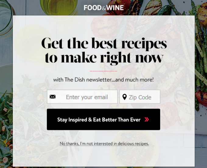 Food & Wine serves up a time-based popup that appeals directly to its demographic user. Visitors to the site come for the recipes, and this popup takes them deeper into the dishes. They only have to wait a few seconds for it to be generated.
Focus On Content
You can specify a website’s popup based on the specific content of a page. In other words, popups can be more than “register and run.” You should tailor popups so that they enhance the user experience. On the design front, this is a bit more labor intensive because you have to take the time to designate the popups for each individual page, as opposed to a general popup that can run across the entire site. Here’s a great example from Wishpond. Their service has many features, but one of them is a tool to create website popups, which they’ve highlighted in this popup on a blog post about great popup examples:
Scroll Popup
Like the time-based popup, the scroll popup can happen after a certain level of usage. In this case, it would mean generating the popup lower in the content piece at around the halfway mark. The only potential drawback is if the user doesn’t make it that far. Regardless, scroll popups come across as less invasive. You’ve given the user their content and now it’s time to consider sharing information. Decent trade-off. The example below from Foodie Fitness is actually both a pop-out popup and a scroll popup that appears about halfway down the page.
A Pop-Out Popup
The pop-out popup comes in from the side of the browser. This lets the visitor continue reading the page without disruption. The most effective pop-out popups are visually enticing. You want to find a way to draw the eye over and encourage the user to interact. Plain text doesn’t cut it for a pop-out popup. In addition to the example above, here’s an example from CopyHackers: This subtle popup follows viewers down the page as they scroll.
Exit Intent Popup
The aptly titled exit intent popup occurs when the user is about to click away from the page. It’s the last bit of information that pops up after users gain what you need from the website. It’s like offering a bonus after they’ve spent time with the company. I’m not done with CopyHackers yet… here is a great exit intent popup from their site. It even animates, with the character pointing to the button to turn it red.
Less Is More
As with everything to do with a website, content is king for your popup ad. The copy should offer a clear and concise benefit. Something free like a newsletter or eBook is always a good way to go. The popup also needs a strong call to action. “Learn more” is nice, but it’s not very enticing. Think outside the popup box to truly engage users, but keep it simple. What does everyone want? Free stuff! CJ Pony Parts recognizes this fact and cuts to the chase in a popup that almost immediately appears on their homepage, offering the chance to win a $250 gift card just for signing up for their newsletter.